Design comparison
SolutionDesign
Solution retrospective
What are you most proud of, and what would you do differently next time?
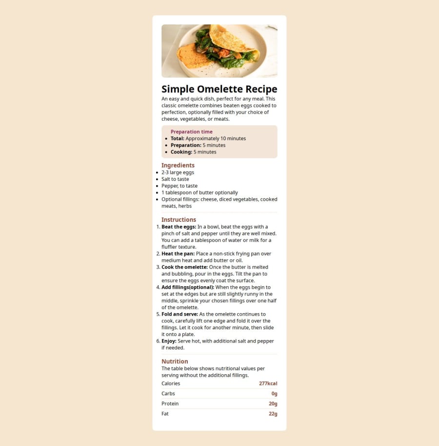
In the table near the footer, I was able to achieve it without using the table element. I used span instead, I didn't expect the result to look that good but I am happy that the results came out well.
What challenges did you encounter, and how did you overcome them?Trying to center the div proved a bit difficult to me at first and also it was cutting at the top. I was able to center the div with the aid of a senior colleague.
What specific areas of your project would you like help with?If there's any errors kindly bring it to my notice so as to make it better.
Community feedback
Please log in to post a comment
Log in with GitHubJoin our Discord community
Join thousands of Frontend Mentor community members taking the challenges, sharing resources, helping each other, and chatting about all things front-end!
Join our Discord
