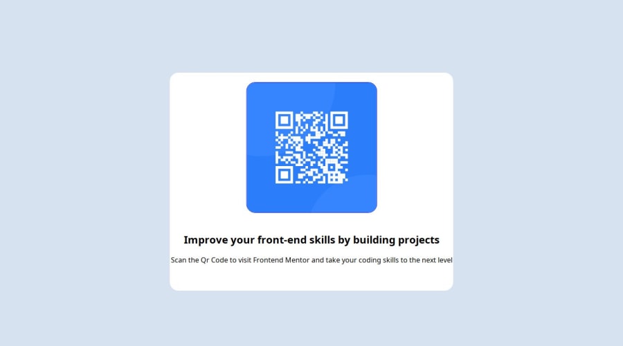
QR code component challenge using HTML and CSS
Design comparison
Solution retrospective
Since I know more about centering and alignment now, I would love to restyle this card again as a test of my improvement. I am proud of the fact that even though this was my first real challenge, I was able to do it well to a considerable extent.
What challenges did you encounter, and how did you overcome them?I had an issue with positioning and I was able to overcome it by asking for help from people. So one lesson is that when you're stuck, ask questions, there are people that are always there and ready to help you.
What specific areas of your project would you like help with?Asides from the positioning, None at the moment.
Community feedback
- @grace-snowPosted about 1 year ago
Hi
I'm afraid this needs more work. It's not finished yet and needs changes that will be foundational to learn for all other projects moving forward. I hope this is helpful
- Keep the order of the head how it was in the starter file. Title should be before your css file link
- All content should be contained within landmarks. Every page at least needs a
mainelement, not just divs - This img is extremely important content. That means it's alt text must be a proper description. It should say what the image is (QR code) and where it goes (to FrontendMentor.io). It is worth reading about how and when to write alt text: https://www.craigabbott.co.uk/blog/how-to-write-good-alt-text-for-screen-readers/
- Always Indent your code consistently so it is readable. Your code editor can even do this formatting automatically for you with prettier.
- Always use a modern css reset at the start of the styles in every project. Andy Bell has a good one you can look up and use.
- Never limit the height of elements that contain text, including the body. Use min-height 100vh instead of height.
- You do not need any absolute or relative positioning in this. Nor do you need transform translate. That's not a good method for centering a component in the viewport. Use flex or grid properties on the body instead.
- The img should not have a width or height. It only needs border radius and the properties that are a standard part of the css reset — display block and max-width 100%. Optionally you could give the img an aspect-ratio of 1 so the browser knows it is square.
- The component should not have a min width or min height. You will rarely need to use those properties ever. Instead all this component needs for it's sizing is a single max width in rem.
- Either the body or main in this should have a little padding on all sides, or the component should have a little margin on all sides to prevent it hitting the screen edges.
- For this to look like the design you must link and apply the correct font families as outlined in the style guide. You must also choose the font sizes, line spacing and font weight etc. Do not leave these things up to the browser defaults that can differ across browsers.
- You need to update the project readme. Get into the habit of doing this every time.
- Ideally you should update your repo so all of the project contents are in the root not in a qr code component subdirectory. Also make sure directory and file names have no capitals or spaces (you can use hyphens instead of spaces)
Marked as helpful0
Please log in to post a comment
Log in with GitHubJoin our Discord community
Join thousands of Frontend Mentor community members taking the challenges, sharing resources, helping each other, and chatting about all things front-end!
Join our Discord
