
@Dracula211Submitted about 3 years ago
Latest solutions
Latest comments
- @banhmisg9509Posted about 3 years ago
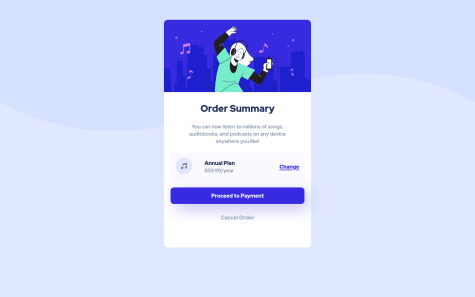
I think it'll look better if you add a transition property when hovering the button, the "change" and "cancel" labels. The padding of the card isn't same as the design, It should be bigger. The space between the music icon and the price tag (annual plan) also is quite far. I hope this comment can help you.
0