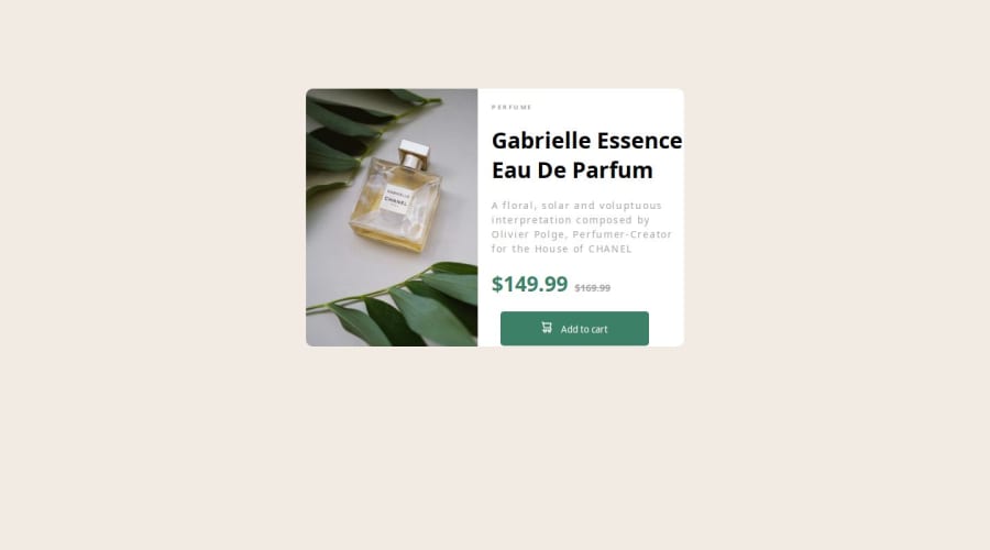
Not Found
Not Found
Not Found
Not Found
Not Found
Not Found
Not Found
Not Found
Not Found
Not Found
Not Found
Not Found
Not Found
Not Found
Not Found
Not Found
Not Found
Not Found
Not Found
Not Found

Submitted

Product Preview Page

#accessibility
Covenant-0 100

@Covenant-0

Desktop design screenshot for the Product preview card component coding challenge

This is a solution for...

  • HTML
  • CSS
1newbie
View challenge

Design comparison


SolutionDesign

Solution retrospective


What are you most proud of, and what would you do differently next time?

I am proud I finally completed this challenge completing this challenge. It took me a number of days.

What challenges did you encounter, and how did you overcome them?

The only challenge i faced was how to display different images on different screen sizes. I made a lot of research and i was finally able to do it. I learnt new things. The snippet below is an example of what i learnt. (```

            ```)

What specific areas of your project would you like help with?

I need help with importing fonts from the google fonts website. I made a lot of research and tried a lot of things but the font did not reflect in the code. If there's anyway i can go about this or any alternative, kindly let me know in the comments below. Thanks

Community feedback

M 920

@Dev-MV6

Posted

Hi there 👋, importing the fonts using the link tag in your HTML is not enough to apply the font family to your page. You need to set the CSS font-family property to the element you want apply the font to in your style-sheet:

h1 {
  font-family: Fraunces, serif;
}

Hope you find this helpful 👍

Marked as helpful

0

Covenant-0 100

@Covenant-0

Posted

@Dev-MV6 Thank you very much for this. I've been stuck on this for a while.

0
Grego 1,260

@Grego14

Posted

👋 Hello! 🎉 congratulations on completing the challenge! 🎉

I recommend that you add the min-height: 100vh property to the body element so that it is centered correctly, but for that to work you must remove the margin-top: 128.75px that you added to the .container element.

I recommend using min-height instead of height in the .container element as it is causing overflows, the min-height property will make sure that the element has a minimum height but that it also can grow.

It is not necessary to add two source elements inside the picture element.

<picture>
  <source media="(max-width: 799px)" srcset="image-product-mobile.jpg">
  <img src="image-product-desktop.jpg" class="image" alt="image of product">
</picture>

Since the image that is in the src of the img element will always be displayed until the screen width is 799px.

Try adding a more descriptive alt attribute.

To make the image take up the entire width of its parent, use min-height: 100%

Try adding more descriptive classes something like this: image-container or product-info and not container1 container-2

I don't see the Google fonts since my blocker prevents them from downloading, but in another comment I saw that someone already told you how to solve it.

I hope this helps! 😁

0

Please log in to post a comment

Log in with GitHub
Discord logo

Join our Discord community

Join thousands of Frontend Mentor community members taking the challenges, sharing resources, helping each other, and chatting about all things front-end!

Join our Discord