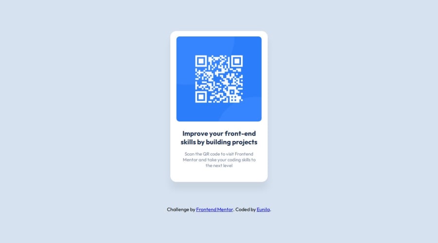
Design comparison
Solution retrospective
I like to learn new things ,so if i mistake something of my code feel free to write feedback .i will be more happy for your feedback
Community feedback
- @Dev-MV6Posted 7 months ago
Hi there 👋, congrats on completing this challenge, you did an excellent job. Your solution looks great.
Just one small suggestion. You can use the
positionproperty to position your.attributionelement absolutely so it doesn't take up any space:.attribution { /* padding: 80px 50px 0px; */ /* margin: 80px 50px 0px; */ position: absolute; bottom: 40px; }https://developer.mozilla.org/en-US/docs/Web/CSS/position#absolute_positioning
Overall your solution looks really good. I hope you find this helpful, let me know if you have any questions, I'll be happy to help 👍
0@EunilaPosted 7 months ago@Dev-MV6 thanks it really help me .i used margin & padding and i also confused that is it the good practice and now i understand , again thank you for your valuable feedback
1@Dev-MV6Posted 7 months ago@Eunila I don't think using
paddingwould be appropriate for a case like this, but there's no problem with usingmarginto set the spacing between your elements (not a bad practice at all).My suggestion was to simply to position your
.attributionelement absolutely so you don't have to worry about the card not being centered. But don't get me wrong, you should definitely usemarginwhenever you need to set spacing between 2 elements.I just gave you the
positiontip because I think that would make your solution perfect, even tho it is very accurate already.In any case, I'm really glad it helped you, let me know if you have further questions.
0@EunilaPosted 7 months agothank you 🥰🥰🥰 for your valuable advice i will remember it @Dev-MV6
1
Please log in to post a comment
Log in with GitHubJoin our Discord community
Join thousands of Frontend Mentor community members taking the challenges, sharing resources, helping each other, and chatting about all things front-end!
Join our Discord
