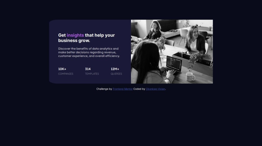
Design comparison
Solution retrospective
I'm most proud of the significant amount of new skills I acquired while tackling this challenge. Despite working at a slower pace, I found immense satisfaction in the knowledge gained throughout the process. Additionally, mastering responsive layouts was a notable achievement for me. Looking ahead, I aim to optimize my workflow to enhance productivity and efficiency in future projects.
What challenges did you encounter, and how did you overcome them?I encountered challenges while implementing responsive layouts, but I found valuable guidance from resources like W3Schools and ChatGPT. Additionally, achieving equal spacing between divs proved challenging, but I resolved it by utilizing the justify-content: space-between property. These experiences underscored the importance of seeking assistance from reliable sources and experimenting with different CSS properties to overcome obstacles effectively.
What specific areas of your project would you like help with?I need help changing the color of the image to match exactly with the project's color scheme. I've conducted my own research, but I couldn't achieve the desired result of matching the color of the image precisely with the project's color scheme.
@Grego14 and many others🙏🙏🙏
Community feedback
- @Dev-MV6Posted 7 months ago
Hi there 👋, good job on completing this challenge.
If you want to improve the final result, you can simply reduce the opacity of the image to
0.75, this will make it match perfectly with the design:#right-side img { mix-blend-mode: multiply; opacity: 0.75; }Hope you find this helpful 👍
0
Please log in to post a comment
Log in with GitHubJoin our Discord community
Join thousands of Frontend Mentor community members taking the challenges, sharing resources, helping each other, and chatting about all things front-end!
Join our Discord
