

Design comparison

Solution retrospective
I had a lot of fun with this one. I think I'll revisit this challenge next time using CSS frameworks.
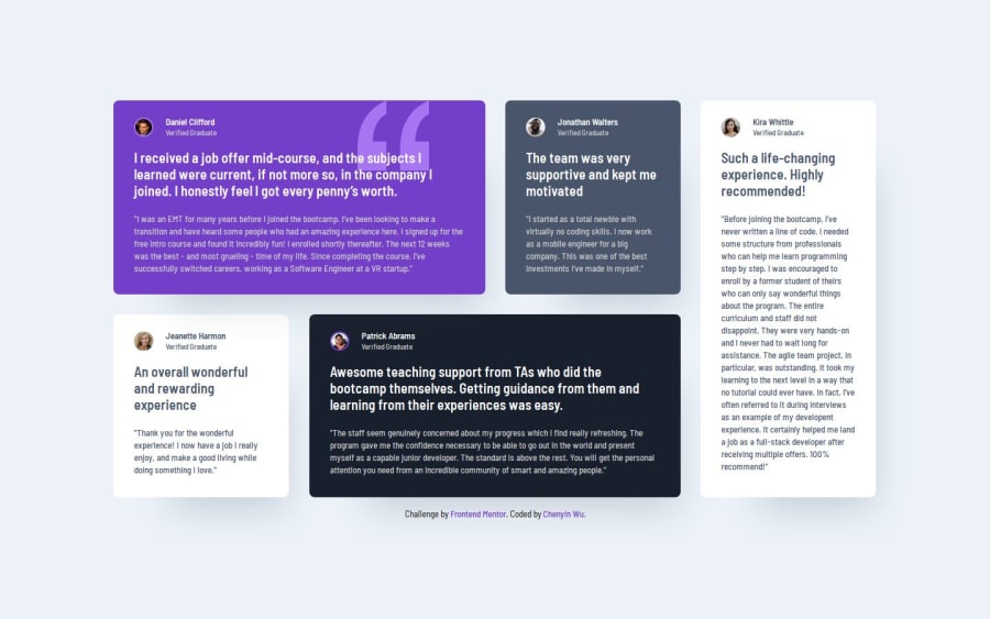
What challenges did you encounter, and how did you overcome them?I struggled a bit getting the grid to work correctly. If you look at the bottom of the card on the very right, the height of it is slightly off from the other cards. I think it has something to do with the amount of rows/columns I made.
What specific areas of your project would you like help with?Please let me know if there's any mistakes I made, or if there's better code I can implement.
Community feedback
- @Dev-MV6Posted 7 months ago
Hi there 👋, your solution looks great.
The reason your element with the
.card5class-name doesn't seem to be aligned correctly with the rest of the cards on the bottom of the grid is because you've set themax-heightproperty to the element, restricting its maximum height to572px.To solve this, simply tweak the value you've set for this property on your style-sheet:
@media (min-width: 1110px) {
  .card5 {
    /* max-height: 572px; */
    max-height: 577px;
  }
}
Hope you find this helpful 👍
Marked as helpful0

Please log in to post a comment
Log in with GitHubJoin our Discord community
Join thousands of Frontend Mentor community members taking the challenges, sharing resources, helping each other, and chatting about all things front-end!
Join our Discord