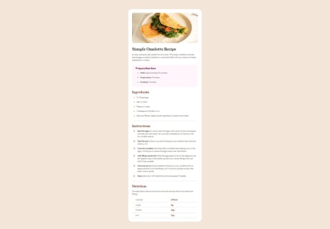
Structure of the HTML, and especially CSS classes and making CSS code more readable because it is a mess- getting pixel perfect design is hard when i dont have clarity about spacing and i end up confused about whether two parts like two h3 tags have equal spacing or not.
I tried making it as close to the design as I know and can, and made the design quite functionally usable unlike some other solutions you may have seen. So please give me some solid advice and mentorship about how to structure the solution properly as I have worked pretty hard on this challenge.
-
Mobile view edges in inspector get rounded but seems like default from Edge browser?
-
My code is kinda Spaghetti code with the classes. How would you advise me to make it more readable with classes and which resource to refer to?
-
Body padding issue in mobile version.
-
Mediaquery : added the breakoff point to 400px width- is it right? Should I be using mediaquery in the first place for this challenge?
-
Should I use rem with mediaquery or pixels?
-
Span tag: How to use it? I used it to make text bold but should I be adding a class to span? Because otherwise if I use several spans I cannot use different css formatting for each. What is the correct way to use span in this context?
-
Pls give me some tips on testing the result. How can I test? Any kind of a process?