

Design comparison

Solution retrospective
I am proud to have completed my first ever challenge without using a tutorial, using mostly search engine, copilot and personal knowledge to finish the project with community support.
*Next time I would like to not use pixel units in CSS and rem instead. *I should pay attention to paragraph titles and be mindful that p1 tag is not used for components. *I should do a CSS reset when beginning the project.
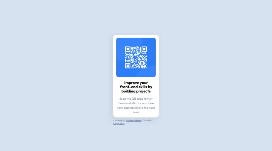
What challenges did you encounter, and how did you overcome them?*After zooming in 250% the QR code got out of the box. I shouldn't limit the height of elements that contain text.
What specific areas of your project would you like help with?I would like to know whether my font sizes are optimal.
Community feedback
- @Gaffen87Posted 11 months ago
You could propably have sized your card better so that your text is equal to the challenge
1 - @tatsuya98Posted 11 months ago
I think the solution looks good. the fonts are easy to read. readable when using different screen sizes
0


Please log in to post a comment
Log in with GitHubJoin our Discord community
Join thousands of Frontend Mentor community members taking the challenges, sharing resources, helping each other, and chatting about all things front-end!
Join our Discord