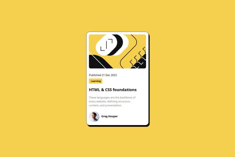
Design comparison
SolutionDesign
Community feedback
- @CaveCodesPosted 11 months ago
1.change the order of "Learning" and the "publishing" 2. set avatar profile pic to max-width: 15% for example; 3. set border-width on the container with class wrapper; 4. use the figtree CSS fonts. 5. use a modern css reset. 6. add padding to body tag so container doesnt touch edges of the page for example when setting width to 245.
0
Please log in to post a comment
Log in with GitHubJoin our Discord community
Join thousands of Frontend Mentor community members taking the challenges, sharing resources, helping each other, and chatting about all things front-end!
Join our Discord
