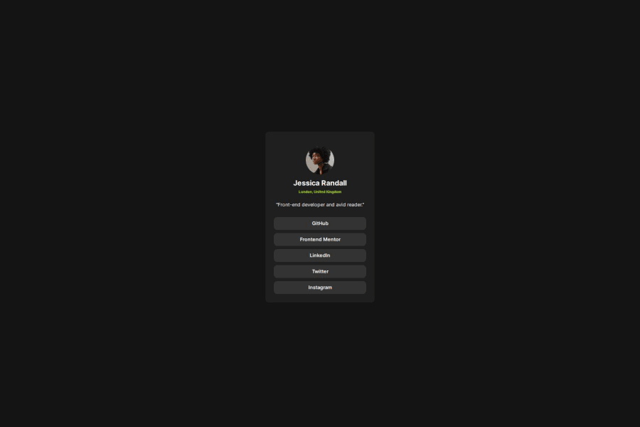
Design comparison
Solution retrospective
I am proud to have completed the project without outside help
What challenges did you encounter, and how did you overcome them?I struggled centering the container on the page and had to look it up again from my previous project. solution was " display: flex; align-items: center; justify-content: center;" on body.
I thought it's :onhover but it was :hover in css.
I struggled to center the profile picture horizontally. I had to set margins to auto.
What specific areas of your project would you like help with?in style-guide it says i should set paragraph font to 14px but when i do it looks different from the design example.
Community feedback
- P@danielmrz-devPosted 11 months ago
Hello there!
Congrats on completing the challenge! ✅
Your solution looks great!
📌 It's recommended to use semantic HTML elements like
<ul>and<li>for creating lists. This ensures that your code is more accessible, maintainable, and semantically meaningful.Here's and example on how you can refactor your code:
After Refactoring
<ul class="list-container">
    <li><a href="#">Github</a></li>
    <li><a href="#">Frontend Mentor</a></li>
    <li><a href="#">LinkedIn</a></li>
    ...
</ul>
By using
<ul>and<li>, you convey the structure of your content more clearly, making it easier for screen readers and search engines to understand. Additionally, it aligns with best practices for HTML semantics.I hope you find this helpful!
Keep up the excellent work!
Marked as helpful0
Please log in to post a comment
Log in with GitHubJoin our Discord community
Join thousands of Frontend Mentor community members taking the challenges, sharing resources, helping each other, and chatting about all things front-end!
Join our Discord

