Not Found
Not Found
Not Found
Not Found
Not Found
Not Found
Not Found
Not Found
Not Found
Not Found
Not Found
Not Found
Not Found
Not Found
Not Found
Not Found
Not Found
Not Found
Not Found
Not Found

All comments

  • @adonesguerreiro

    Submitted

    What are you most proud of, and what would you do differently next time?

    I feel like I'm improving the CSS, and I'm improving the responsive part more.

    What challenges did you encounter, and how did you overcome them?

    Replacing the desktop image with the mobile image was quite challenging.

    What specific areas of your project would you like help with?

    Responsive layout and HTML.

    CaveCodes 70

    @CaveCodes

    Posted

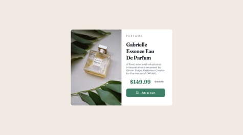
    1. your product title text font weight is a bit too heavy.
    2. your line-height spacing in the paragraph is a bit too much.
    3. reflect these tips https://fedmentor.dev/posts/html-plan-product-preview/
    4. better to add google fonts to HTML not css.
    5. do a modern css reset.
    6. add the font colors etc using css variables. for example:

    /* GLOBAL STYLES */ :root { --primary-color-1: hsl(158, 36%, 37%); --primary-color-2: hsl(30, 38%, 92%);

    --neutral-color-1: hsl(212, 21%, 14%); --neutral-color-2: hsl(228, 12%, 48%); --neutral-color-3: hsl(0, 0%, 100%);

    --fs-paragraph: 0.5rem;

    --fw-500: 500; --fw-700: 700; --font-family-1: Montserrat; --font-family-2: Fraunces; }

    and then in css use this format:

    font-weight: var(--fw-700);"

    1. add padding to body or margin to main to make some space on the edges.

    2. use rem not pixels for width and height and on most things...pixels are not very scalable.
    Marked as helpful

    0
  • Kaarel 60

    @KarlaXBT

    Submitted

    What are you most proud of, and what would you do differently next time?

    I am proud that I finished the project mostly by myself and using my knowledge.

    What challenges did you encounter, and how did you overcome them?

    I learned a nit about media queries, using chatGPT.

    What specific areas of your project would you like help with?

    I had issue with over naming classes with using BEM, making the HTML classes overly complicated.

    CaveCodes 70

    @CaveCodes

    Posted

    Tere, • <article> peaks olema main tag-i sees kuna foto on peamise teema (retsepti) osa. • Teha modern css reset • Body { font-weight: 300;} peaks olema 400 mitte 300 vastavalt style-guide.md-le. • .recipe { max-width: 736px;} ei soovita siin kasutada piksleid- selle asemel rem ühikuid. •Üldiselt kasutada rem ühikuid mitte piksleid nii palju kui võimalik.

    0
  • P

    @ralphvirtucio

    Submitted

    What are you most proud of, and what would you do differently next time?

    I'm most proud of how ease I can do the project and time.

    What challenges did you encounter, and how did you overcome them?

    For this project I didn't encounter any tough challenges.

    What specific areas of your project would you like help with?

    Your feedback will be much appreciated ! !

    CaveCodes 70

    @CaveCodes

    Posted

    1.Usually the file is called styles.css not style.css but it's ok. 2. I would mark the start and end of the css reset with comments to make code more readable but just my personal opinion.

    Otherwise really good... i got a few ideas for my own project too thanks. Such as transition in css. and adding colors to :root.

    One question: I wonder how did you make it so that the links boxes shrink when reducing the width in the browser? how do u get it to be responsive? I want to learn for my project. thanks

    1
  • CaveCodes 70

    @CaveCodes

    Posted

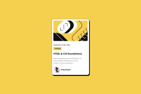
    1.change the order of "Learning" and the "publishing" 2. set avatar profile pic to max-width: 15% for example; 3. set border-width on the container with class wrapper; 4. use the figtree CSS fonts. 5. use a modern css reset. 6. add padding to body tag so container doesnt touch edges of the page for example when setting width to 245.

    0
  • P
    Célia 30

    @Celia-HC

    Submitted

    What are you most proud of, and what would you do differently next time?

    NA

    What challenges did you encounter, and how did you overcome them?

    Finding a shadow matching the design : I used a light grey with a lot of transparency.

    What specific areas of your project would you like help with?

    I have a small space between the image and the with the text. It's not a margin nor a padding and I don't know how to explain it. When I inspect, I don't see where it comes from.

    CaveCodes 70

    @CaveCodes

    Posted

    *Do a modern CSS reset to fix the spacing issue.

    • Use https://www.cssmatic.com/box-shadow to fine-tune the shadows *When width gets below 320px when inspecting, the text gets cut off.
    • Do not limit the size of the container/QR code with pixels. Otherwise it cannot expand. Use rem units instead when appropriate.
    • move
    0