Had a problem with the Google fonts online. I was not able to use font-weight when included from the CDN. But when I downloaded them and included them locally the font-weight property started to work properly.
Am sure this is not a good approach since it will slow down the page's loading speed. So, in the next projects I will try to use the ones from the CDN and figure out why the weights are not working on them.
Hi,
I think I know why the font weight was not working. When importing Google Fonts, you need to select the font weights as well. For example, A ROBOTO font will have different options, like 300 light, regular 400, bold 700 etc. You need to select all the font-weight you plan on using. Then you don't need to download the font pack, it will work with the cdn only.
Congratulations on completing this challenge!!🎉🎉 While going through your code, I found certain things that might be of help to you.
For the styling of the body tag, you can actually omit position: relative and width:100%. This is because even if you don't define the width of any container element, it's width is taken 100% by default. As for the position:relative, it's just unnecessary. Instead of defining the height as 100vh, define the min-height as 100vh for better responsiveness. min-height:100vh.
For the .card, instead of assigning the width, assign the max-width. This way, you set a limit to the width, and at the same time, not keep the width constant. Do not define the height of the card. This way, you can ensure that the card takes up as much space as it requires, and no extra space is wasted. Additionally, you can also omit the media query, as it will not be required once you remove the declaration of height.
In order to prevent overflow, set only the top margin of the info section as 1rem.
Congratulations on completing this challenge!!!🎉🎉🎉
I have some suggestions that will help you a lot.
Since the picture is changing with screen size, it is better to enclose the img in a picture tag. By using picture tag, you won't need to use media query to change the src. For more information on the picture tag, click here.
Instead of defining the font-family for multiple elements individually, it would be better to define it once for all elements.
For example,
span.old-price, span.cart, p, h2{
font-family: 'Montserrat', sans-serif;
}
Provide the alt for the icon cart image. Make it a point to always provide the alt text for it tells the browser what to show if image cannot be displayed.
Replace the div outside the main tag, by a footer tag. Since, the ending div is supposed to be a footer, enclose it within the landmark tag footer for better accessibility.
Congratulations on completing this challenge!!🎉🎉🎉🎉
I have some suggestions that might help you.
For the body, you don't need to define width:100% and align-items: flex-start as these as default values. Even if you don't mention it, flex-start and width:100% is applied by default. You can use align-items to center the elements of the body. To learn how to center a div, click here.
Don't make the height of the body element constant by defining the height. Instead, define the min-height to make the body responsive. min-height: 100vh.
For the container, define the max-width instead of width for better responsiveness.
Provide a left and right margin of 2rem to the description. Although your layout is perfect, your margin and padding are off.
Try using relative units like rem and em more than absolute units like px, to aid in better responsiveness.
Provide a meaningful alt text because it is what is going to be displayed if the image cannot be displayed. So, giving a meaningful alt lets the user know what the image is about.
Hope this feedback helps you in your coding journey. Have a nice day!!
I have some suggestions that might pique your interests.
Replace the h2 tag with an h1 tag. It is always preferred to start with h1 and gradually move your way down the heading levels.
Instead of defining the width of the card, define the max-width. By defining only the max-width, you are specifying the maximum width the card can take up, but its width can reduce depending on the screen size. However, by defining width, you are making the width of the card constant. Use max-width for better responsiveness.
Try using relative units like rem and em instead of absolute unit like px. The px values are constant irrespective of screen sizes, and may result in overflow in some screens. The rem and em depend on the screen size, thereby catering to better responsiveness. For more info, click here.
Hope this feedback helps you to improve and grow. Have a nice day!!!
I have some suggestions for you, which might be of help to you.
Instead of assign the width of the card, assign the max-width, to make the card responsive.
Replace
.card{
width: 380px;
}

with
.card{
max-width:380px;
}
The text Equilibrium #3429 is actually a heading. Therefore use an h1 tag instead of a p tag. Then you won't have to define the font-weight manually, and it will also get rid of the accessibility issues.
<h1>Equilibrium #3429</h1>
Provide an alt statement to the img tag. The alt tells the browser what to show if the image cannot be displayed. To learn more about alt, click here
Tags like main, aside, article, nav are known as landmarks. Landmarks are special parts of the page, where screen readers and other assistive technologies can traverse to. It is always a good practice to provide landmarks in your code. Wrap the whole content of the body before the footer, inside the main tag. For more info on landmarks, click here.
Instead of defining a class named footer, replace the last div tag with a footer tag.
Hope this feedback helps you improve your skills. Have a nice day!!
Hi,
Congratulations on completing the challenge. I have some tips that might be of help to you.
You are using the relative path in the src of the img tag. You have mentioned the path as /qr-code-component-main/image-qr-code.png. However, for any element present inside a secondary folder within the root folder, the path starts with ./. So, your correct path should be ./qr-code-component-main/image-qr-code.png . Always give an alt text, which specifies what to show if for any reason the image can't be displayed. Replace your img tag with the following.
<img src="./qr-code-component-main/image-qr-code.png" alt="QR code image" />
Replace the h3 tag by the h1 tag. Always start from h1 and keep on decreasing one level. This will help prevent accessibility issues.
Wrap the whole content in the body of the html inside main tag. To learn more about accessibility and semantic html, click here.
In the index.html file, you are not using the style tag, so it's better to remove it. This helps you keep only the necessary lines of code.
While centering in the body, instead of height, define the min-height for better responsiveness. You don't need to add width:100% since, 100% of the width is taken by default if nothing is mentioned.
Define the max-width of the container, instead of the width to make it more responsive.
Hope this feedback helps you to improve in the future. Have a nice day!!
Hi,
Congratulations on completing this challenge!!!🎉🎉🎉🎉
I have a few suggestions which might help you.
Replace the h2 tag with h1 tag to fix the accessibility issue.
For .boxContent, instead of defining width, define the max-width to make the card responsive.
Replace
.boxContent{
width: 320px
}

With
.boxContent{
max-width: 320px
}
By defining the height, you are making the height of the card constant. This means that even if there was no text, the card would take up that much height, thus wasting the space. By not defining height, the height of the card remains variable, i.e. , it can change depending upon the content inside of the card.
Try using relative units like rem and em instead of absolute units like px. This helps in better responsiveness, as px value remains constant throughout, and rem and em change according to the screen size. To know more, click here.
Hi,
Congratulations on solving this challenge!!🎉🎉
I have some suggestions that I feel will help you improve a lot.
Instead of defining width, define the max-width for the container. When you define width, you are making the width of that element a constant, it will not be able to change automatically. However, when you are defining max-width, you are making the the width of the element variable, such that the width can decrease by itself depending on the screen size, thereby making the component responsive.
Try to use more relative units like em and rem for defining the size, instead of absolute units like px. The relative units help in better responsiveness of the component, as they will set the component's size in comparison to the screen size, and not on the fixed pixel value. To learn more info on CSS units, click here
If the font-size for the root element or the body is 16px, you don't need to define it. This is because the default font size of most browsers is 16px. So, even if you don't mention it, it will be automatically taken as 16px.
For the titleOrder Summary, replace the p tag with an h1 tag, since it is a header. Then you won't have to define the font-size or the font-weight, all will be taken care of by h1.
Instead of using font-weight, it is better to use the <b> tag, to make a piece of text bold. Both <b> and font-weight achieve the same result, however <b> will save you few extra lines of CSS. Use font-weight only when you have to alter the boldness of a text.
Hope you find this comment useful. Have a nice day!!!
I just finished my third challenge. I want your suggestions what can be improved and in general what you like or you don't like. Thank you in advance for feedback :)
Hi,
Congratulations on solving this challenge!!!🎉🎉🎉🎉
I just went through your code, and have a few suggestions that I feel will help you.
Replace the h3 tag with an h1 tag to get rid of the accessibility issue.
In the CSS file, you don't have to mention width:100% to the body tag, because, for any element, if width is not mentioned, it takes up a 100% of its width by default.
In the body tag, replace the height:100vh with min-height:100vh, for better responsiveness.
For the p tag inside the div class="value" tag, instead of using font-weight, you can use the <b></b> to make the text bold, thereby requiring one less CSS line.
<p><b>0.041 ETH</b></p>
Hope this comment helps you. Please feel free to correct me if I said anything incorrect. Have a nice day!!
Hi,
Congratulations on completing this challenge. I have some suggestions, which I think will help improve your skill.
For the footer text, use the footer tag instead of div.
Wrap all the content inside the body tag, except the footer tag, in main tag.
Replace the h2 tag with an h1 tag. This will get rid of the accessibility issue.
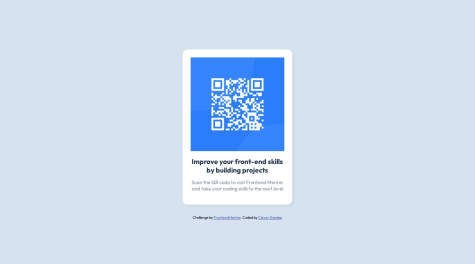
The image can't be viewed, because the code doesn't know where to search for the images folder. To fix that, add a ./ at the start of the source of the img tag.
Replace
<img src="images/image-qr-code.png" alt="Qr">

with

<img src="./images/image-qr-code.png" alt="Qr">
For the container, instead of specifying the width, specify only the max-width. This will help achieve responsiveness, and you will also not need the media query.