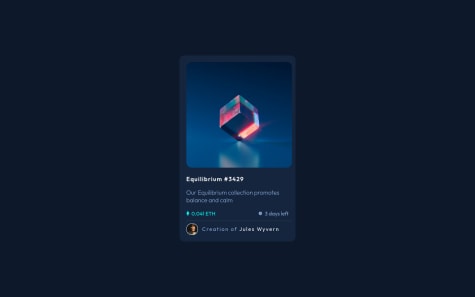
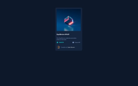
I couldn't put the eye on the image . I tried a loooot of ways but without sucess. can anyone give me a tip for this? And please give a general feedback, what i can change, add, remove. Thanks!
Youssef Waleed
@ywsolimanAll comments
- @yuuricrzSubmitted about 2 years ago@ywsolimanPosted about 2 years ago
Hey @yuuricrz, I hope you're doing great!
Here's how to do the image hover part using
position:- HTML:
<div class="image"> <img class="img" src="images/image-equilibrium.jpg" alt="Equilibrium Image" /> <div class="image-overlay"> <img src="images/icon-view.svg" alt="Eye Icon" /> </div> </div>- CSS:
main .image {
    position: relative;
}
main .image .img {
    display: block;
    max-width: 100%;
}
main .image .image-overlay {
    position: absolute;
    top: 0;
    left: 0;
    width: 100%;
    height: 100%;
    background-color: rgba(0, 255, 247, 0.3);
    display: flex;
    justify-content: center;
    align-items: center;
    transition-duration: 0.5s;
    cursor: pointer;
    opacity: 0;
}
main .image .image-overlay:hover {
    opacity: 1;
}
I hope this was helpful. Here's my solution if you want to take a look: https://www.frontendmentor.io/solutions/nft-card-using-css-flexbox-WCOwgj9t9d
Keep up the great work!👏
Marked as helpful0 - @Nikola-MiticSubmitted about 2 years ago
I have a lot of trouble finding the size that they want us to use, if someone could tell me where I can find that out I would appreciate it.
I also didn't (know how to) do the image hover part, everything else should be correct.
If I made any mistakes, and if there's a better/easier way of doing things, let me know!
@ywsolimanPosted about 2 years agoHey @Nikola-Mitic, I hope you're doing great!
Here's how to do the image hover part using
position:- HTML:
<div class="image"> <img class="img" src="images/image-equilibrium.jpg" alt="Equilibrium Image" /> <div class="image-overlay"> <img src="images/icon-view.svg" alt="Eye Icon" /> </div> </div>- CSS:
main .image {
    position: relative;
}
main .image .img {
    display: block;
    max-width: 100%;
}
main .image .image-overlay {
    position: absolute;
    top: 0;
    left: 0;
    width: 100%;
    height: 100%;
    background-color: rgba(0, 255, 247, 0.3);
    display: flex;
    justify-content: center;
    align-items: center;
    transition-duration: 0.5s;
    cursor: pointer;
    opacity: 0;
}
main .image .image-overlay:hover {
    opacity: 1;
}
I hope this was helpful. Here's my solution if you want to take a look: https://www.frontendmentor.io/solutions/nft-card-using-css-flexbox-WCOwgj9t9d
Keep up the great work!👏
Marked as helpful1 - @LeonardclcSubmitted about 2 years ago
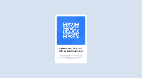
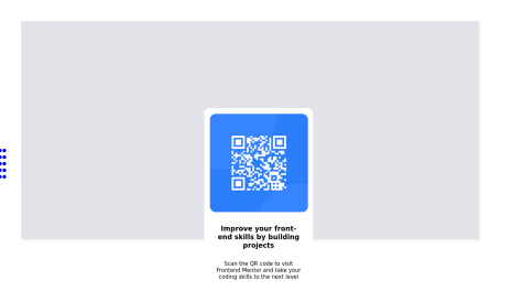
My QR code image seems to have a bad resolution, how do I fix it?
How do I use flexbox properly to centralize my wrapper and image?
@ywsolimanPosted about 2 years agoHey @leoweabo, I hope you're doing great!
To perfectly center your wrapper horizontally and vertically:
- Using Flex:
html, body { height: 100%; } body { margin: 0; } .wrapper { display: flex; justify-content: center; align-items: center; height: 100%; }- Using Grid:
html, body { height: 100%; } body { margin: 0; } .wrapper { display: grid; place-content: center; height: 100%; }- Using Position:
html, body {
    height: 100%;
}
body {
    margin: 0;
    position: relative;
}
.wrapper {
    position: absolute;
    top: 50%;
    left: 50%;
    transform: translate(-50%, -50%);
}
Here's my solution using if you want to take a look: https://www.frontendmentor.io/solutions/qr-component-using-css-flex-FxuBLT9kE9
Keep up the great work!👏
Marked as helpful1 - @NajamdevSubmitted about 2 years ago
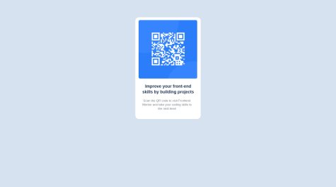
the only issue I faced while making this design was that I couldn't make the margin-top feature work properly. I need to know what was the thing behind it.
@ywsolimanPosted about 2 years agoHey @Najamdev, I hope you're doing great!
Using margin-top isn't the best thing to do to vertically center your container. You could use CSS Flex or Grid.
- Using Flex:
body { margin: 0; padding: 0; display: flex; justify-content: center; align-items: center; height: 100vh; }- Using Grid:
body {
    margin: 0;
    padding: 0;
    display: grid;
    place-content: center;
    height: 100vh;
}
I have some suggestions for your code if you don't mind:
- You should use HTML Semantic Elements instead of div as it doesn't have a real meaning
<div>should be<main>because the main element identifies the main content of the page. - From a semantic point of view, using an h3 without an h2 or h1 is not good practice.
- Use relative units such as
remoreminstead ofpxto improve your performance by resizing fonts between different screens and devices.
Here's my solution using if you want to take a look: https://www.frontendmentor.io/solutions/qr-component-using-css-flex-FxuBLT9kE9
Keep up the great work!👏
0 - @dquindara8Submitted about 2 years ago
Hello all. How do you specifically center an image on the webpage or html body? Thanks.
@ywsolimanPosted about 2 years agoHey @hossamyosri, I hope you're doing great!
You could use CSS Flex to vertically and horizontally center your container. Here's how:
body {
    margin: 0;
    padding: 0;
    display: flex;
    justify-content: center;
    align-items: center;
    height: 100vh;
}
I am just a newbie, but here's my solution if you want to take a look:
https://www.frontendmentor.io/solutions/qr-component-using-css-flex-FxuBLT9kE9
Keep up the great work!👏
0 - @XtrumSubmitted about 2 years ago
This is my first try after two weeks into HTML & CSS....!
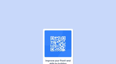
Building this project, I couldn't wrap my hands on "how to make the QR code image scale-down with the container"......... so, I kind of manipulate that with "property: relative;" in my CSS sheet.
I am somewhat convince I didn't get it right and I will really appreciate any help to better my coding skill.
@ywsolimanPosted about 2 years agoIt's just two weeks and you are already killing it!
To make the QR image scale with the container, you can simply give it
max-width:100%I recommend you to read more about CSS Flexbox and CSS Grid, they will help you a lot through your journey. You could center your container vertically and horizontally using one of them.
I am just a newbie, but here's my solution if you want to take a look:
https://www.frontendmentor.io/solutions/qr-component-using-css-flex-FxuBLT9kE9
Keep up the great work!👏
0 - @GauthamRVanjreSubmitted about 2 years ago@ywsolimanPosted about 2 years ago
Hey @GauthamRVanjre, I hope you're doing great!
I have some suggestions for your code if you don't mind:
- You should use HTML Semantic Elements instead of div as it doesn't have a real meaning
<div>should be<main>because the main element identifies the main content of the page. - Use relative units such as
remoreminstead ofpxto improve your performance by resizing fonts between different screens and devices.
Keep up the good work!👏
Marked as helpful2 - You should use HTML Semantic Elements instead of div as it doesn't have a real meaning
- @Agbaje14Submitted about 2 years ago
All feedback is welcomed. Thank you in advance
@ywsolimanPosted about 2 years agoHey @Agbaje14, I hope you're doing great!
I have some suggestions for your code if you don't mind:
- You should use HTML Semantic Elements instead of div as it doesn't have a real meaning
<div class="first">should be<main class="first">because it's the main element identifies the main content of the page. - From a semantic point of view, using an h4 without an h3, h2, or h1 is not good practice. And therefore,
<h4">Improve your front-end skills by building projects</h4>should be
<h1">Improve your front-end skills by building projects</h1>as it is the main title of the card and change the font size if you're not happy with it.
- You should center the QR component horizontally and vertically using CSS Flexbox or CSS Grid instead of using margin top and left.
- A best practice will be separating content from design, you should avoid inline styles instead give classes if needed and design in CSS separate file
Keep up the good work!👏
Marked as helpful1 - You should use HTML Semantic Elements instead of div as it doesn't have a real meaning
- @hossamyosriSubmitted about 2 years ago
none
@ywsolimanPosted about 2 years agoHey @hossamyosri, I hope you're doing great!
I have some suggestions for your code if you don't mind:
- You should use HTML Semantic Elements instead of div as it doesn't have a real meaning
<div>should be<main>because the main element identifies the main content of the page. - From a semantic point of view, using an h3 without an h2 or h1 is not good practice.
- You should center the QR component horizontally and vertically using CSS Flexbox or CSS Grid instead of using margin.
- Use relative units such as
remoreminstead ofpxto improve your performance by resizing fonts between different screens and devices.
Keep up the good work!👏
0 - You should use HTML Semantic Elements instead of div as it doesn't have a real meaning
- @happyvisuSubmitted about 2 years ago@ywsolimanPosted about 2 years ago
Hi Vishal, I hope you're doing great! I am a newbie but I have some notes if you don't mind
- You should use HTML Semantic Elements instead of div as it doesn't have a real meaning
<div class="rec">should be<main class="rec">because it's the main content of the page. - From a semantic point of view, using an h3 without an h2 or h1 is not good practice. And therefore,
<h3 class="heading">Improve your front-end skills by building projects</h3>should be
<h1 class="heading">Improve your front-end skills by building projects</h1>and change the font-size if you're not happy with it.
Keep up the good work!
Marked as helpful0 - You should use HTML Semantic Elements instead of div as it doesn't have a real meaning
