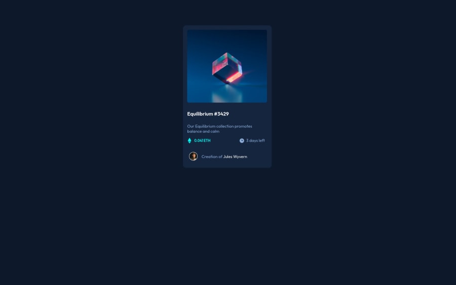
Design comparison
SolutionDesign
Solution retrospective
All feedback is welcomed. Thank you in advance
Community feedback
- @ywsolimanPosted about 2 years ago
Hey @Agbaje14, I hope you're doing great!
I have some suggestions for your code if you don't mind:
- You should use HTML Semantic Elements instead of div as it doesn't have a real meaning
<div class="first">should be<main class="first">because it's the main element identifies the main content of the page. - From a semantic point of view, using an h4 without an h3, h2, or h1 is not good practice. And therefore,
<h4">Improve your front-end skills by building projects</h4>should be
<h1">Improve your front-end skills by building projects</h1>as it is the main title of the card and change the font size if you're not happy with it.
- You should center the QR component horizontally and vertically using CSS Flexbox or CSS Grid instead of using margin top and left.
- A best practice will be separating content from design, you should avoid inline styles instead give classes if needed and design in CSS separate file
Keep up the good work!👏
Marked as helpful1@Agbaje14Posted about 2 years ago@ywsoliman Thanks for your feedback sir. I will try my best to keep improving :)
0 - You should use HTML Semantic Elements instead of div as it doesn't have a real meaning
Please log in to post a comment
Log in with GitHubJoin our Discord community
Join thousands of Frontend Mentor community members taking the challenges, sharing resources, helping each other, and chatting about all things front-end!
Join our Discord
