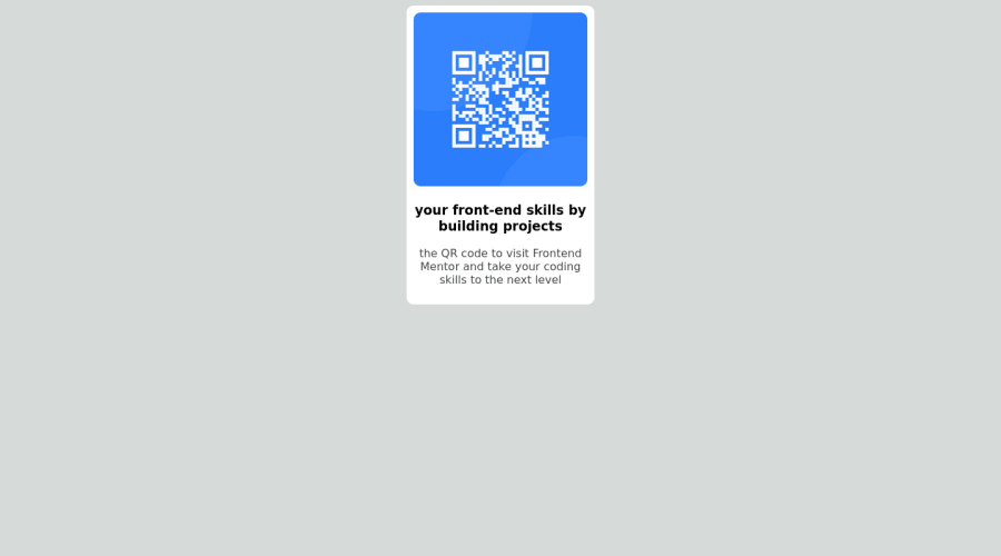
QR code design created using visual code studio


Design comparison

Solution retrospective
the only issue I faced while making this design was that I couldn't make the margin-top feature work properly. I need to know what was the thing behind it.
Community feedback
- @ywsolimanPosted about 2 years ago
Hey @Najamdev, I hope you're doing great!
Using margin-top isn't the best thing to do to vertically center your container. You could use CSS Flex or Grid.
- Using Flex:
body { margin: 0; padding: 0; display: flex; justify-content: center; align-items: center; height: 100vh; }- Using Grid:
body {
    margin: 0;
    padding: 0;
    display: grid;
    place-content: center;
    height: 100vh;
}
I have some suggestions for your code if you don't mind:
- You should use HTML Semantic Elements instead of div as it doesn't have a real meaning
<div>should be<main>because the main element identifies the main content of the page. - From a semantic point of view, using an h3 without an h2 or h1 is not good practice.
- Use relative units such as
remoreminstead ofpxto improve your performance by resizing fonts between different screens and devices.
Here's my solution using if you want to take a look: https://www.frontendmentor.io/solutions/qr-component-using-css-flex-FxuBLT9kE9
Keep up the great work!👏
0@sahand-masolehPosted about 2 years ago@ywsoliman It's better not to use 100vh because it will break on mobile browsers because of the address bar.
You can just use 100% on the parent containers with the same result without the issues.
0@ywsolimanPosted about 2 years ago@sahand-masoleh I tried removing
height: 100vhfrom<body>and instead usingheight: 100%in<main>but it didn't work. I would be grateful if you explained more. Thank you!0@sahand-masolehPosted about 2 years ago@ywsoliman Sure.
What I do is that I set a
height: 100%on all the parents leading to the one that contains the UI (usually HTML and body), and amin-height: 100%on the the element that contains the UI (by default .app in case of React).Note that problems associated with viewport units don't show up on the responsive mode of a desktop browser, only when you actually open the page in a mobile browser.
edit: In this particular page, main is the card, so set a
height: 100%on HTML and body, anddisplay: grid; place-items: centeron body to see the results.0


Please log in to post a comment
Log in with GitHub
Join our Discord community
Join thousands of Frontend Mentor community members taking the challenges, sharing resources, helping each other, and chatting about all things front-end!
Join our Discord