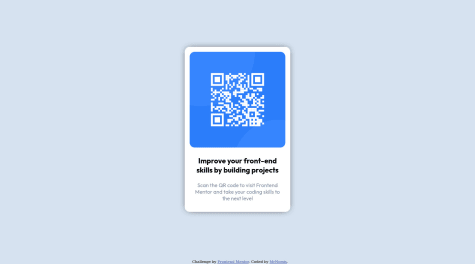
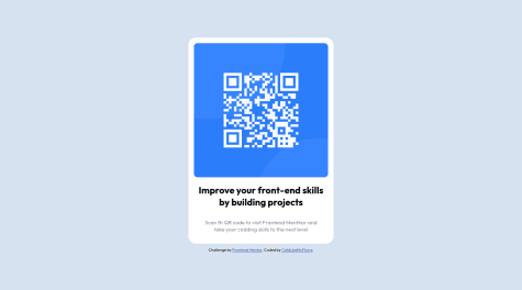
@MrNomisSubmitted over 2 years ago
i still don´t know what is the right way to center a div horizontally and vertically... if anyone can help with that it would be very appreciated.

i still don´t know what is the right way to center a div horizontally and vertically... if anyone can help with that it would be very appreciated.
Good work 🌸🌸🌸
If you want to center a component with flexbox you can use this:
.your_div {
  display: flex;
  justify-content: center;
  align-items: center;
}
and the parent element for your div must have height: 100%;
Some other suggestions for achieving a better work:
I hope my advice help you. Keep going! 🌸🌸🌸
Awesome work. I have some suggestions for a better result:
Keep going these awesome works 🌺🌺🌺
Hello developers, I have done this challenge using HTML, CSS, & JS . I am looking forward to hear your feedback. I appreciate your time :) Thank you!
Awesome! Really good work. Some suggestions for better result:
Good work! Keep going🌸🌸🌸
I used GSAP to make loading animations for this project, let me know whether you like it or I should improve something. That was my first time using Parcel and GSAP, so this project isn't that advanced. But as they say practice makes perfect.
Any feedback how can I improve animations and my code are highly appreciated and welcome here!
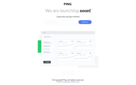
My solution to the Ping Coming Soon project. I feel like my js code can be refactored more but let me know what you think!
Hey! That's Awesome. Really good work. For better transition on social media icons you can use to transitions like this:
a:hover i {
  /* Other codes */
  transition: background-color 0.5s, color 0.5s;
}
and
a i {
  transition: background-color 0.5s, color 0.5s;
}
Good luck!
My first project :) I will be glad to any feedback
Great job ❤️❤️
1- title color is a bit lighter than black. You can use 'Dark blue' color for title. its value is in style-guide.md file.
Good lock 👌👌👌
I will be happy, to hear any feedback and suggestion
Awesome 👏👏👏
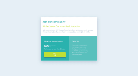
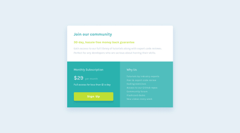
1- For 'Why Us' section it's better to use lists in HTML because it actually is a list but if you don't want to use that you need to put them in different lines.
2- don't use flex method for centering element in mobile view because it's cause overflow issues. You fixed overflow in vertical direction but in horizontal direction some texts aren't readable.
Great work. Good lock ❤️❤️❤️
Hello, Frontend Mentor community! This is my solution to the Testimonials grid section.
I have read all the feedback on this project and improved my code. Due to the fact that I published this project very long ago, I am no longer updating it and changing its status to Public Archive on my Github.
You are free to download or use the code for reference in your projects, but I no longer update it or accept any feedback.
Thank you
Fantastic 😍😍😍 I think it's better use font weight 600 for headings and replace black color in 'Such a life-changing experience. Highly recommended!' heading with """Very dark grayish blue""". Awesome work👏👏👏 Good lock!
hey guys your feedback is most valuable for me so pls share your feedback my second project .thank you
Really good 👏👏👏 I think using a lighter color in box shadow for button makes your result better.
Incorporated CSS variables into project and reduced the use of compound selectors after watched one of Kevin Powell's videos on the drawbacks.
Had fun with this project!
Awesome 👏👏 Only one suggestion: Your component has radius on top corners but has no radius on bottom corners.