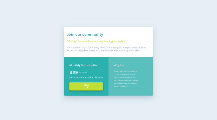
Design comparison
Solution retrospective
I will be happy, to hear any feedback and suggestion
Community feedback
- @boedegoatPosted almost 3 years ago
Great work AditNovadianto. You've done fantastic job
In order to fix your accessibility issue, you can add
<main>tag to be the wrapper of your entire component.Other than that, stay code and happy coding
Marked as helpful1@AditNovadiantoPosted almost 3 years ago@boedegoat thnakyou for your advice next i will practice more about
<main>tag0 - @moheb2000Posted almost 3 years ago
Awesome 👏👏👏
1- For 'Why Us' section it's better to use lists in HTML because it actually is a list but if you don't want to use that you need to put them in different lines.
2- don't use flex method for centering element in mobile view because it's cause overflow issues. You fixed overflow in vertical direction but in horizontal direction some texts aren't readable.
Great work. Good lock ❤️❤️❤️
Marked as helpful0@AditNovadiantoPosted almost 3 years ago@moheb2000 thankyouu for your advice!!!!
0
Please log in to post a comment
Log in with GitHubJoin our Discord community
Join thousands of Frontend Mentor community members taking the challenges, sharing resources, helping each other, and chatting about all things front-end!
Join our Discord
