Submitted almost 3 years ago
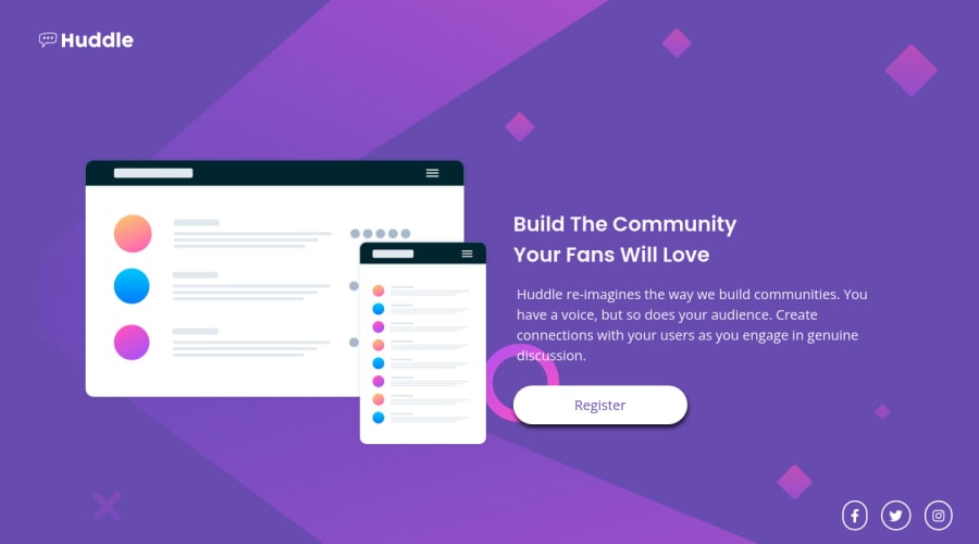
Mobile first Huddle landing page with single introductory section
@snake321
Design comparison
SolutionDesign
Solution retrospective
hey guys your feedback is most valuable for me so pls share your feedback my second project .thank you
Community feedback
- @NaveenGumastePosted almost 3 years ago
Hay ! Good Job scarydeveloper
These below mentioned tricks will help you remove any Accessibility Issues
-> Add Main tag after body
<main class="container"></main>Keep up the good work!
Marked as helpful1 - @moheb2000Posted almost 3 years ago
Really good 👏👏👏 I think using a lighter color in box shadow for button makes your result better.
0
Please log in to post a comment
Log in with GitHubJoin our Discord community
Join thousands of Frontend Mentor community members taking the challenges, sharing resources, helping each other, and chatting about all things front-end!
Join our Discord
