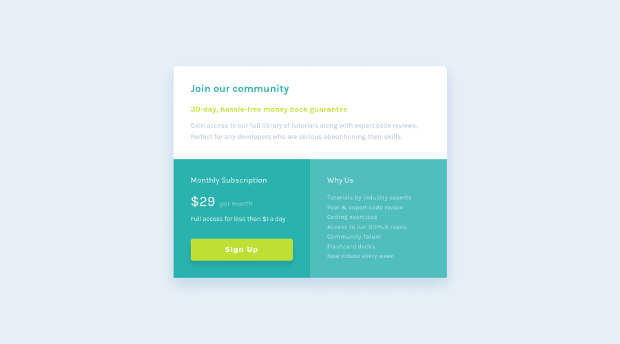
Design comparison
Solution retrospective
Incorporated CSS variables into project and reduced the use of compound selectors after watched one of Kevin Powell's videos on the drawbacks.
Had fun with this project!
Community feedback
- Account deleted
Hi there 👋
Congratulate on finishing your project 🎉. You did a great job 🔨
I give some suggestions that I hope help you take your project to the next level 📈.
One thing about the design you can add some hover effects to the button 💡
Happy coding ☕
Maqsud
Marked as helpful1@CodyJPerryPosted almost 3 years ago@maqsudtolipov Thanks for the feedback! Added a slight adjustment for the buttons hover and focus states to the button using css filters.
Have a great day!
1 - @moheb2000Posted almost 3 years ago
Awesome 👏👏 Only one suggestion: Your component has radius on top corners but has no radius on bottom corners.
0@CodyJPerryPosted almost 3 years ago@moheb2000 Thanks! I did that to match the figma design.
0
Please log in to post a comment
Log in with GitHubJoin our Discord community
Join thousands of Frontend Mentor community members taking the challenges, sharing resources, helping each other, and chatting about all things front-end!
Join our Discord