Do you have any suggestions for making the code cleaner? Any best practices I need to adopt?
Mike Hayden
@mickygingerAll comments
- @ananfitoSubmitted about 2 years ago@mickygingerPosted about 2 years ago
Hi Antony!
Firstly, this looks great, so well done!
If you look at the accessibility report above you should see some improvements that you should consider best practice. You can click on the Learn more link for more info and directions on how to resolve these issues.
Probably most important is to consider semantic markup when structuring your HTML.
I would also favour using an absolute path eg:
/images/image-qr-code.pngover a relative path eg:./images/image-qr-code.pngfor your image links. This can be a bit tricky when developing locally if you load yourindex.htmlfile directly into the browser, rather than using a webserver and running you site on localhost.In any case I would recommend serving your files using a webserver on localhost in your development environment. Check out this StackOverflow post for more info on running your project on localhost.
Hope that was helpful!
Marked as helpful1 - @mauger1998Submitted about 2 years ago
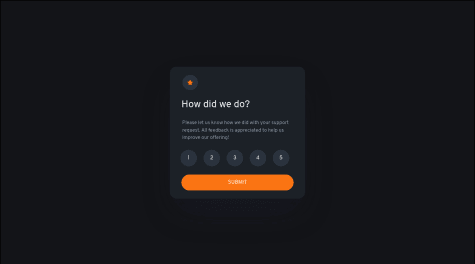
So this is literally the first time I have ever used javascript, I managed to get a few things working but the issue I am having is when I click on one of the ratings its always the number 1 that turns orange, I also have no idea how to get the message to tell you how many stars you have selected, if anybody can help me I would be extremely greatful I have been watching youtube videos for hours, tried debugging with the devtools and read loads of articles online and I cant find the answer.
Update
I have now tried giving each number a unique id but it still does not work and making sure the variable names are not the same as the ids just incase this is confusing but now when I click on any number the 5 is orange instead of the one. also when the pop up comes on it is not in the same place as the card was, someone please help
Update The click function is working now thanks to making all the functions seperate names, the pop up still comes up in a different place to the card depending on the screen size tho and I still cant get the message to tell you how many stars you gave
@mickygingerPosted about 2 years agoHey Mauger,
This looks great! I think @Yavanha has left some great feedback above, but just to reiterate the most salient point: when you name a function you will overwrite an existing function of the same name:
function hello() {
  console.log('hello');
}

function hello() {
   console.log('goodbye');
}

hello(); // this will log "goodbye" because the second function has overwritten the first
There's loads of different approaches to this challenge but I think the way I would do it is to assign the
textContentproperty of the button (ie the actual text inside the button), to a variable on click. Then you can display that in the popup.If you think about each HTML element as an object that you can interrogate (or get properties from), then you can write a function that asks the button that was clicked what its text content is and then append that to the popup. Something like this:
<div class="numbers">
  <button>1</button>
  <button>2</button>
  <button>3</button>
  <button>4</button>
  <button>5</button>
</div>
<section class="popup">
  <div class="result">You selected ? out of 5</div>
</section>
const buttons = document.querySelectorAll('button'); // get ALL the buttons in one go const popup = document.querySelector('.popup'); const result = document.querySelector('.result'); function handleClick() { const selected = this.textContent // get the text content of the button that was clicked this.classList.add('clicked'); // `this` refers to the button that was clicked result.textContent = `You selected ${selected} out of 5` // update the text of the popup with the selected amount popup.classList.add('open-popup'); } buttons.forEach(function(button) { button.addEventListener('click', handleClick); // assign the click handler to each button }I think this approach also means you can simplify your css a little. Here's a little more info on
thisin JavaScript. It's kinda nuanced and weird but very powerful! Don't expect to get it straight away, but simply put it refers to the thing that called the function. So forclickevents the button that was clicked, for scroll events thewindowthat was scrolled, forkeyupevents, the key that was depressed...Oh, also you should use
buttonand notdivfor the buttons. Firstly for semantic reasons but also for accessibility.Hopefully that helps. Let me know if you have any questions :)
1 - @ShanvieSubmitted over 2 years ago
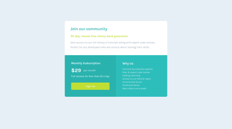
Hello guys ,i am happy to say that after completing my first periodic test i have summited the projects any suggestion you want to give me they are most welcomed..
@mickygingerPosted over 2 years agoHi Akshita, this looks great, well done.
I think you just need to be award of the semantics of your HTML.
You need to have one and only one
h1tag on your page. Looking at the design perhaps that should beJoin our community.I think semantically "$29 per month" is a single element, and probably not a heading, so perhaps your should change your markup to something like:
<p class="subscription__month">
  <span class="subscription__dollar">$29</span> per month
</p>
Hopefully that's helpful! :D
Marked as helpful0 - @Co1eCas3Submitted over 2 years ago
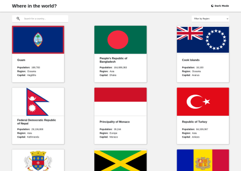
There's a bug still where the theme is reverting to the initial state on navigation. If anyone can point out what is causing that, would be grateful. Currently makes absolutely no sense to me...
@mickygingerPosted over 2 years agoHey RyanC, this looks great!
I'm not familiar with Svelte but checking
localStorage, thecountries-color-settingvalue never changes when you toggle dark mode.I think the problem might be on this line:
if (darkModeSaved != null) darkModeSaved = darkModeSaved === 'true';The logic is quite complex because you're attempting to save the string values
trueandfalseinlocalStoragewhich are bothtruthy, and you also have to deal withnull.I would instead use the 1 and 0, rather than 'true' and 'false'. I would also probably call the localStorage key something like
isLightModebecause it's a bit more idiomatic, and the default (or null value) would be dark mode on (orisLightMode: 0).This should make your toggle method a little easier to reason about:
function toggleLightMode() {
  const isLightMode = +localStorage.getItem('isLightMode');
  localStorage.setItem('isLightMode', isLightMode ? 0 : 1);
}
You'll notice the "+" in front of
localStoragethat converts the value returned fromgetIteminto a number, so '1' becomes 1, '0' becomes 0 and null also becomes '0'. This is called a unary operator.In the
setItemmethod I'm using a turnary operator, this is basically an inline if / else statement. IfisLightModeis truthy (ie not 0), then setisLightModeto 1 otherwise set it to 0.Now you should be able to make your
loadmethod a bit more terse... something like:export async function load() { if (!browser) return {}; let isLightMode = +localStorage.getItem('isLightMode'); let prefersDarkTheme = window.matchMedia('(prefers-color-scheme: dark)').matches; return { props: { darkModeEnabled: !isLightMode ?? prefersDarkTheme } }; }Marked as helpful2 - @huntoorSubmitted over 2 years ago
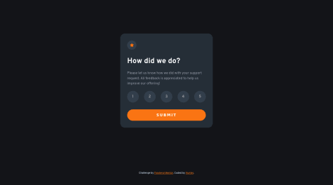
My first project using javascript. Is my solution for the project good? And how can I improve it?
All feedback is welcome!
@mickygingerPosted over 2 years agoHey Hunter this looks great!
Since it's your first JS project, I thought I'd give you some feedback on your JavaScript.
You've set out all your global variables at the top of the file, which is great, and initialized some sensible defaults. I think perhaps
cardOneandcardTwoare not particularly descriptive variables, so I would probably recommend calling themratingCardandsuccessCardor similar. This helps to reason about the code.You've misspelled
ratingwhich is very minor, but is probably worth changing for clarity.Since
0is falsey in JavaScript you can tidy up your submit button click handler a little:submitBtn.addEventListener("click", () => { if (!ratting) return error.classList.remove("hidden"); selectedRatting.innerHTML = `You selected ${ratting} out of 5`; cardOne.classList.add("hidden"); cardTwo.classList.remove("hidden"); })The
returnkeyword will prevent the rest of the function logic from running so you don't need anelseclause in that case.You have named your
removeActivefunction, but used anonymous arrow functions elsewhere. Personally I prefer named functions since you get more specific error messaging, and you can more easily add and remove event handlers that way. Something like:function handleSubmit() { if (!ratting) return error.classList.remove("hidden"); selectedRatting.innerHTML = `You selected ${ratting} out of 5`; cardOne.classList.add("hidden"); cardTwo.classList.remove("hidden"); } submitBtn.addEventListener("click", handleSubmit)Finally you don't really need to use data attributes here because the value is stored as the text content of the button albeit a string, but that's quite easy to convert to a number:
ratting = Number(rattingBtn.textContent); // or +rattingBtn.textContentIt's worth mentioning these are all very minor style points and should be considered suggestions and not the "correct" way to write JavaScript. What you have written is easy to read, and is not overly complex in its solution, so very well done!
Marked as helpful2 - @deepak-asnaniSubmitted about 3 years ago
Any feedback will be appreciated.
@mickygingerPosted about 3 years agoHey Deepak, this looks great! 🎉
I would advise that you make your mobile styles the default and modify them on larger breakpoints using
min-widthmedia queries, rather than the other way round.You can also add a nice
box-shadoweffect to match the design. box-shadow generators like this one are a nice way to experiment before adding the styles to your CSS.Hope that's helpful!
Marked as helpful0 - @AmazingCukrSubmitted about 3 years ago
Hi all,
this is my 1st attempt for this challange. I tried to make it little bit responsive but it doesnt exactly match the original image tho. Also I dont know how to change color for that picture. All criticism/help is much welcome :)
@mickygingerPosted about 3 years agoHey David,
This looks great on desktop, but as you alluded to above the mobile layout is a little off.
You've added a couple of empty divs, presumably for layout purposes? We shouldn't really be adding unnecessary markup, padding and margin (or
gapin the case of grid) should be sufficient.You're using grid which is great, but perhaps flexbox would be a better idea here. If you aim to do the mobile layout first you can set
flex-direction: columnso that the image sits above the content, then change toflex-direction: row-reverseon desktop so that the image sits to the right of the content.Here's a really useful guide to flexbox from CSS-Tricks, hopefully you'll find it helpful 😀
0 - @greeshmaymSubmitted about 3 years ago
Hi, This is my first challenge on Forntend Mentor.I think Design is OK but it doesnt scale accordingly to browser size.Any leads would be helpful.
@mickygingerPosted about 3 years agoHi Greeshma! 👋
First of all, this looks great, so well done! 🎉
You're always going to have difficulties when using absolute positioning for layout, so I would strongly advise against it. Absolute positioning is good when you want to position something over the top of something else, and in relation to it. If you look at the notification bell icon on Frontend Mentor, you'll see that there's a red notch that appears indicating how many unread notifications you have. That's absolutely positioned, but mostly we use flexbox or grid to position our elements on the page.
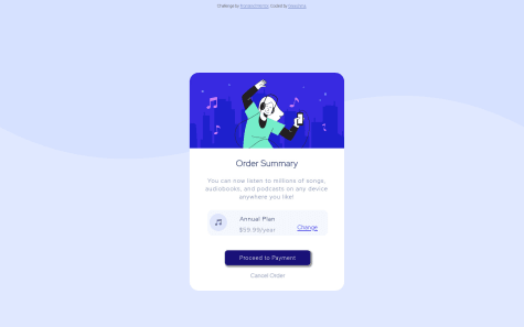
You can position your order summary component by with flexbox like so:
body {
  margin: 0;
}

.main-block {
  display: flex;
  flex-direction: column;
  align-items: center;
  justify-content: center;
  height: 100vh;
}
Then remove
position: absoluteandleft: 36%from.sub-block.Here's a great guide to flexbox by CSS-Tricks.
Hope that helps! 😀
Marked as helpful0 - @Nabil19911Submitted about 3 years ago
Please Rate my code. your feedbacks will help me improve in my journey.
@mickygingerPosted about 3 years agoHey Nabil! 👋
You've done a great job here, so well done! 🎉
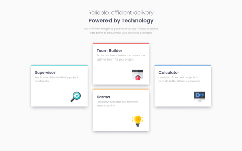
I think there may be a simpler way to position your cards. Generally I would avoid absolute positioning if you can possibly help it.
How about this for your tablet styles:
.cards {
  display: flex;
  flex-direction: row;
  max-width: 700px;
  flex-wrap: wrap;
  justify-content: space-evenly;
}

.cards .card {
  margin-bottom: 10px;
}
Then update them on desktop like so
.cards {
  max-width: 1120px;
}

.cards .card {
  margin-bottom: 25px;
}

.cards .card:nth-child(1), .cards .card:nth-child(4) {
  transform: translateY(-50%);
}
Using
transform: translateYis nice because you don't have to set explicit sizes, so the card will always move by half its own height, regardless of the content.Hope that helps! 🤓
Marked as helpful2 - @yasser22269Submitted about 3 years ago
Please feel free to test it, and give me some feedback! (づ。◕‿‿◕。)づ
@mickygingerPosted about 3 years agoHi Yasser! 👋
This is cool! I have a couple of small suggestions:
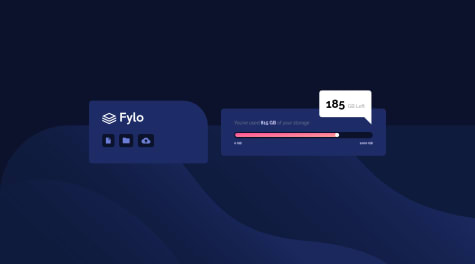
The background image is cropped on larger screens. I'm not sure the best approach here, but I think that setting
background-size: cover; background-position: 50vh;might make it look reasonable on most viewport sizes.If you set
align-items: flex-endondiv.cardsthe two panels will line up by their bottom edges which matches the design.The only other thing I would recommend is that you take a look at the progress element. It's not the easiest thing to style, but it makes sense semantically here.
I hope that's useful! 🤓
Marked as helpful1 - @lvisanaSubmitted about 3 years ago
Tell me your thoughts! Thank you <3
@mickygingerPosted about 3 years agoHey Luisana!
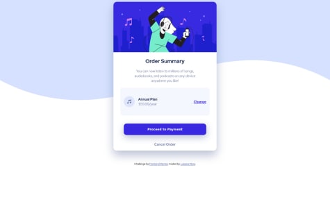
This looks really good, and I agree with @civisky, centering the component would be a nice touch.
You can do that using flexbox, something like:
body {
    margin: 0; /* remove the annoying margin added by the browser */
    height: 100vh; /* set the height to match the viewport height */
    display: flex;
    flex-direction: column; /* make sure the footer sits below the content */
    justify-content: center; /* center the contents vertically */
}
Hope that helps!
Marked as helpful0 - @Eugene44-hubSubmitted about 3 years ago
I also added an additional feature, dark and light mode. Please i need a feedback on the view especially. And also i noticed that the time doesn't countdown on some phones. please your feedbacks will really help me thanks.
@mickygingerPosted about 3 years agoHi Eugene! 👋
Firstly this looks great, and I love that you've added your own spin to the design with the Christmas theme.
The
setIntervalin your code is probably not behaving quite as you expect. The second argument is the delay between executions of the callback in milliseconds. So for example:setTimeout(() => { console.log('Hi Eugene'); }, 5000)Would print
Hi Eugeneto the console every 5000ms (or 5s) for ever (and ever and ever...).You've set the delay to
Infinitywhich by some strange twist of JavaScript logic is converted into 0, which means you're executing the callback as soon as possible at the time, but realistically probably 100s or 1000s of times a second.Since you only need the clock to tick every second, you can change
Infinityto something a little less demanding like1000or perhaps500if you want the clock to tick closer to the actual time your system clock ticks. Anything lower than60is redundant because that's likely to be your screen refresh rate, so you wouldn't notice it at all.You can stop the
setIntervalwithclearInterval. This StackOverflow post has some good examples.You should also grab your clock's DOM elements outside of the callback, because otherwise you're retrieving them from the page every time the callback runs (which is an expensive operation for JavaScript). Something like this will be a lot more efficient:
const days = document.querySelector('#days');
const hours = document.querySelector('#hours');
const minutes = document.querySelector('#minutes');
const seconds = document.querySelector('#seconds');

setInterval(e => {
  // rest of code
}, 1000);
OK, I hope that all makes sense. Please let me know if you have any questions!
1

