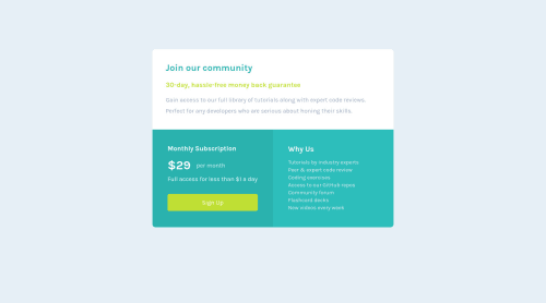
Submitted over 3 years agoA solution to the Single price grid component challenge
Single price grid component
accessibility
@Shanvie

Solution retrospective
Hello guys ,i am happy to say that after completing my first periodic test i have summited the projects any suggestion you want to give me they are most welcomed..
Code
Loading...
Please log in to post a comment
Log in with GitHubCommunity feedback
No feedback yet. Be the first to give feedback on Akshita 👩💻's solution.
Join our Discord community
Join thousands of Frontend Mentor community members taking the challenges, sharing resources, helping each other, and chatting about all things front-end!
Join our Discord