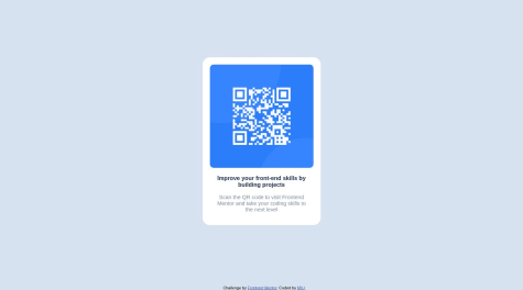
Not Found
Not Found
Not Found
Not Found
Not Found
Not Found
Not Found
Not Found
Not Found
Not Found
Not Found
Not Found
Not Found
Not Found
Not Found
Not Found
Not Found
Not Found
Not Found
Not Found

All comments

  • khushboo khatwani• 1,070

    @khushi0909

    Posted

    1. Read about h1 tag its the most important and every website should have atleast one https://www.semrush.com/blog/h1-tag/
    0
  • khushboo khatwani• 1,070

    @khushi0909

    Posted

    1)you should learn about semantics HTML and using it for ex footer ,main etc

    2)image should always have alt="some description". some description about image should always be there for accessibility reasons

    https://www.davidmacd.com/blog/alternate-text-for-css-background-images.html

    3)Read about h1 tag its the most important and every website should have atleast one https://www.semrush.com/blog/h1-tag/

    4)your text is going outside the center

    5)i liked that you used the media queries for responsiveness ,but you need to practice a little bit because even with that, in every screen size ,your text are going out of the container and its not good

    All the best

    Marked as helpful

    0
  • khushboo khatwani• 1,070

    @khushi0909

    Posted

    1)you should learn about semantics HTML and using it for ex footer ,main etc

    2)Read about h1 tag its the most important and every website should have at least one https://www.semrush.com/blog/h1-tag/

    3)now it looks good on every screen ,but you can read about media queries for responsiveness for the future

    solution looks good ,All the best

    Marked as helpful

    0
  • RKanna• 150

    @RKanna

    Submitted

    I tried this one, Can any one suggest me how to improve this code?

    Responsive CSS

    #accessibility

    2

    khushboo khatwani• 1,070

    @khushi0909

    Posted

    1)Read about h1 tag its the most important and every website should have atleast one https://www.semrush.com/blog/h1-tag/

    2)you should learn about semantics HTML and using it for ex footer ,main etc

    3)image should always have alt="some description". some description about image should always be there for accessibility reasons

    https://www.davidmacd.com/blog/alternate-text-for-css-background-images.html

    4)i feel something wrong with the positioning of the background image or color you have used ,its creating some problem in responsiveness view for different screen and you are getting lot of scroll bar both vertically and horizontally ,it should not be ideally as per design like this

    5)i personally feel using flexbox in the body tag will also be better' and mentioning in body min-height as 100vh may help (read about min-height 100vh more)

    All the best

    Marked as helpful

    0
  • khushboo khatwani• 1,070

    @khushi0909

    Posted

    1 you should learn about semantics HTML and using it for ex footer ,main etc

    2)Read about h1 tag its the most important and every website should have atleast one https://www.semrush.com/blog/h1-tag/

    3)width: 275px; ,instead of fixed card width ,you should try to use min-width or max-width accordingly for better responsiveness

    All the best

    Marked as helpful

    1
  • khushboo khatwani• 1,070

    @khushi0909

    Posted

    1)image should always have alt="some description". some description about image should always be there for accessibility reasons

    2)you should learn about semantics HTML and using it for ex footer ,main etc

    3)Read about h1 tag its the most important and every website should have at least one https://www.semrush.com/blog/h1-tag/

    4)now it looks good on every screen ,but you can read about media queries for responsiveness for the future

    All the best

    Marked as helpful

    0
  • khushboo khatwani• 1,070

    @khushi0909

    Posted

    1)image should always have alt="some description". some description about image should always be there for accessibility reasons

    2)now it looks good on every screen ,but you can read about media queries for responsiveness for the future

    All the best

    1
  • Md. Sohel Rana• 20

    @Sohel-Rana0

    Submitted

    This solution so easy. If you want to more about please contact with me. Thank you .

    Qr-code-component

    #jss#sass/scss#react

    3

    khushboo khatwani• 1,070

    @khushi0909

    Posted

    1. image should always have alt="some description". some description about image should always be there for accessibility reasons

    2)container is not in the center as required by the design ,you should make it center by using flexbox or transform properties reead more about it

    3)Responsiveness has some problem ,if i check this in mobile size of 320 px qr code goes out of the container ,in this context you can also read more about the media queries

    All the best

    0
  • Igor• 230

    @MIU-cz

    Submitted

    khushboo khatwani• 1,070

    @khushi0909

    Posted

    1)you should learn about semantics HTML and using it for ex footer ,main etc

    2)Read about h1 tag its the most important and every website should have atleast one https://www.semrush.com/blog/h1-tag/

    3)now it looks good on every screen ,but you can read about media queries for responsiveness for the future

    All the best

    Marked as helpful

    0
  • khushboo khatwani• 1,070

    @khushi0909

    Posted

    1)Read about h1 tag its the most important and every website should have atleast one https://www.semrush.com/blog/h1-tag/

    2)you should learn about semantics HTML and using it for ex footer ,main etc

    3)now it looks good on every screen ,but you can read about media queries for responsiveness for the future

    All the best

    0
  • khushboo khatwani• 1,070

    @khushi0909

    Posted

    1. you should learn about semantics HTML and using it for ex footer ,main etc

    2)Read about h1 tag its the most important and every website should have atleast one https://www.semrush.com/blog/h1-tag/

    1. width: 300px; height: 480px; you have fixed width and height for the containers ,ideally it should be max-width or min-width accordingly and it helps in better responsiveness .

    2. left: 50%; top: 50%; margin-left: -150px; margin-top: -250px;

    instead of this try transform property that will be good ,putting so much margin is not a good practice and may create the problem in future

    left: 50%; top: 50%; transform:translate(50%,50%) read more about it

    5)with mobile screen i find it too small container ,may be feels like it will not be much readable to the user

    now it looks good on every screen ,but you can read about media queries for responsiveness for the future

    All the best

    0
  • khushboo khatwani• 1,070

    @khushi0909

    Posted

    1. i find the content big as compared to the expected design

    2)Read about h1 tag its the most important and every website should have atleast one https://www.semrush.com/blog/h1-tag/

    3)now it looks good on every screen ,but you can read about media queries for responsiveness for the future

    All the best

    Marked as helpful

    0
  • khushboo khatwani• 1,070

    @khushi0909

    Posted

    1. you need to look on responsiveness through the media queries etc ,because if check it in mobile screen botton attribution class thing is overlapping with the "scan qr code.. content .

    2)image shoult always have alt="some description".some description about image should always be there for accessibility reasons

    https://www.davidmacd.com/blog/alternate-text-for-css-background-images.html

    All the best

    Marked as helpful

    0
  • khushboo khatwani• 1,070

    @khushi0909

    Posted

    Read about h1 tag its the most important and every website should have atleast one https://www.semrush.com/blog/h1-tag/

    I liked the responsiveness done through the media queries

    keep it up ,All the best

    0
  • khushboo khatwani• 1,070

    @khushi0909

    Posted

    1)now it looks good on every screen ,but you can read about media queries for responsiveness for the future

    2)Read about h1 tag its the most important and every website should have atleast one https://www.semrush.com/blog/h1-tag/

    All the best

    Marked as helpful

    0
  • khushboo khatwani• 1,070

    @khushi0909

    Posted

    1)Read about h1 tag its the most important and every website should have atleast one https://www.semrush.com/blog/h1-tag/

    2)you should learn about semantics HTML and using it for ex footer ,main etc

    3)now it looks good on every screen ,but you can read about media queries for responsiveness for the future

    All the best

    0
  • khushboo khatwani• 1,070

    @khushi0909

    Posted

    1)Read about h1 tag its the most important and every website should have atleast one https://www.semrush.com/blog/h1-tag/

    2)now it looks good on every screen ,but you may read about media queries for responsiveness for the future

    3)you have implemented the semantics html ,that good

    All the best :-)

    Marked as helpful

    0
  • @nachospreafico

    Submitted

    I found really difficult to align the card to the center of the body for the desktop version, so the way I managed it is what I am most unsure of. Is it good practice to add display: grid to the body? Thanks in advance!

    khushboo khatwani• 1,070

    @khushi0909

    Posted

    1. its ok to add grid but i think you need more learning and practice for grid and i think you must have used grid template-column 1fr 1fr 1fr or there are other ways also to do .read

    https://css-tricks.com/snippets/css/complete-guide-grid/

    2)you can also use flexbox for centering or transform:translate() etc

    3)i cannot see any responsiveness implemented ,it will be great if you do that with for ex media queries etc

    4)Read about h1 tag its the most important and every website should have atleast one https://www.semrush.com/blog/h1-tag/

    5)you should learn about semantics HTML and using it for ex footer ,main etc

    All the best

    Marked as helpful

    0
  • khushboo khatwani• 1,070

    @khushi0909

    Posted

    1)image should always have alt="some description".some description about image should always be there for accessibility reasons

    https://www.davidmacd.com/blog/alternate-text-for-css-background-images.html

    2)you should learn about semantics HTML and using it for ex footer ,main etc

    3)Read about h1 tag its the most important and every website should have at least one https://www.semrush.com/blog/h1-tag/

    4)body should never have fixed width as width: 1440px;,you should di it as max-width:100vh or min -width etc

    5)responsiveness is implemented ,that is good .

    All the best :-)

    0
  • khushboo khatwani• 1,070

    @khushi0909

    Posted

    1)image should always have alt="some description".some description about image should always be there for accessibility reasons

    https://www.davidmacd.com/blog/alternate-text-for-css-background-images.html

    2)now if I see its okay for all the screen ,but for future to implement responsiveness you should learn more about media queries etc .

    All the best

    Marked as helpful

    1
  • khushboo khatwani• 1,070

    @khushi0909

    Posted

    1)you should learn about semantics HTML and using it for ex footer ,main etc

    2)Read about h1 tag its the most important and every website should have at least one https://www.semrush.com/blog/h1-tag/

    3)image should always have alt="some description". some description about image should always be there for accessibility reasons

    https://www.davidmacd.com/blog/alternate-text-for-css-background-images.html😊

    4)responsiveness for different screens looks good but you can read about media queries for future

    All the best :)

    0
  • Gbengs• 20

    @Gbengs

    Submitted

    All feedbacks and contributions are welcome on this project

    khushboo khatwani• 1,070

    @khushi0909

    Posted

    1. image cannot be seen in your live site ,but i can see in your code and looks fine

    2)you should learn about semantics HTML and using it for ex footer ,main etc

    3)everything else seems good

    All the best

    Marked as helpful

    1
  • khushboo khatwani• 1,070

    @khushi0909

    Posted

    1)now if i see its okay for all the screen ,but for future to implement responsiveness you should learn more about media queries etc .

    2)Read about h1 tag its the most important and every website should have atleast one https://www.semrush.com/blog/h1-tag/

    3)you should learn about semantics HTML and using it for ex footer ,main etc

    All the best

    0
  • Ismae1• 20

    @Ismae1

    Submitted

    This is my second challenge. Any feedback on my code would be great. I was trying to get my card to stay center when lower than 375px

    khushboo khatwani• 1,070

    @khushi0909

    Posted

    1. too big card as per requirement it should be little small and i think thats creating lot of vertical scroll bar

    2)you should learn about semantics HTML and using it for ex footer ,main etc

    3)for centering try to use flexbox or transform:translate() property ,I cant see both in your code ,learn flexbox and grid .

    4)instead of using fixed width ,should use max-width for the body or min-height 100vh etc ..

    All the best :)

    Marked as helpful

    0