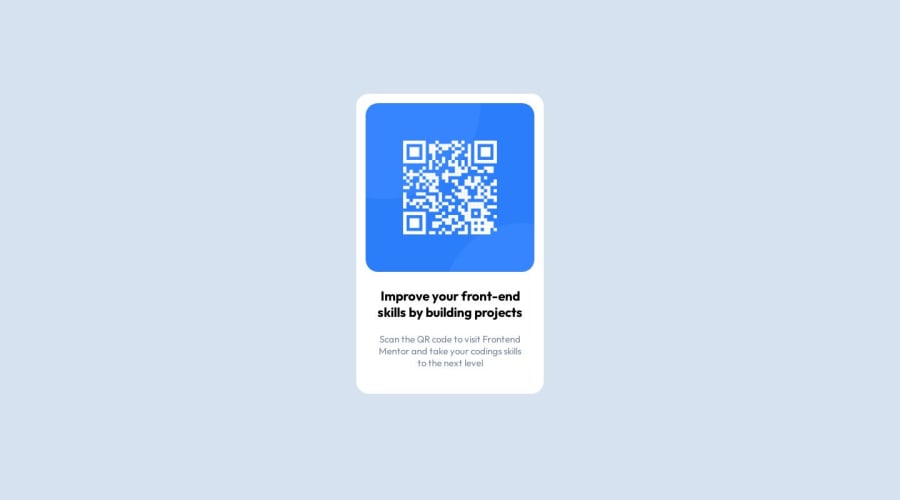
Design comparison
Community feedback
- @floatingPebblePosted almost 2 years ago
Looks really nice!
I've noticed the following:
- Looks like you forgot to change the title text
colorfrom default black. - It is a best practice to avoid using generic
<div>tags if possible, so in this case, you can use<main>tag on your main-container element. border-radiuslooks a little bigger than it should be. Maybe try setting it to 12px.
I hope you find this helpful.
Cheers, and happy coding!
1 - Looks like you forgot to change the title text
- @khushi0909Posted almost 2 years ago
- you should learn about semantics HTML and using it for ex footer ,main etc
2)Read about h1 tag its the most important and every website should have atleast one https://www.semrush.com/blog/h1-tag/
-
width: 300px; height: 480px; you have fixed width and height for the containers ,ideally it should be max-width or min-width accordingly and it helps in better responsiveness .
-
left: 50%; top: 50%; margin-left: -150px; margin-top: -250px;
instead of this try transform property that will be good ,putting so much margin is not a good practice and may create the problem in future
left: 50%; top: 50%; transform:translate(50%,50%) read more about it
5)with mobile screen i find it too small container ,may be feels like it will not be much readable to the user
now it looks good on every screen ,but you can read about media queries for responsiveness for the future
All the best
0 - @0xabdulkhaliqPosted almost 2 years ago
Hello there 👋. Congratulations on successfully completing the challenge! 🎉
- I have other recommendations regarding your code that I believe will be of great interest to you.
HTML 🏷️:
- This solution may cause accessibility errors due to lack of semantic markup, which causes lacking of landmark for a webpage and allows accessibility issues to screen readers, due to accessibility errors our website may not reach its intended audience, face legal consequences, and have poor search engine rankings, highlighting the importance of ensuring accessibility and avoiding errors.
- What is meant by landmark ?, They used to define major sections of your page instead of relying on generic elements like
<div>or<span>. They are use to provide a more precise detail of the structure of our webpage to the browser or screen readers
- For example:
- The
<main>element should include all content directly related to the page's main idea, so there should only be one per page - The
<footer>typically contains information about the author of the section, copyright data or links to related documents.
- The
- So resolve the issue by replacing the
<div class="main-container">element with the proper semantic element<main>in yourindex.htmlfile to improve accessibility and organization of your page
.
I hope you find this helpful 😄 Above all, the solution you submitted is great !
Happy coding!
0
Please log in to post a comment
Log in with GitHubJoin our Discord community
Join thousands of Frontend Mentor community members taking the challenges, sharing resources, helping each other, and chatting about all things front-end!
Join our Discord
