@hdreddySubmitted almost 2 years ago
What did you find difficult while building the project? Container Positioning Which areas of your code are you unsure of? I wanna get better at positioning containers exactly where I want.

What did you find difficult while building the project? Container Positioning Which areas of your code are you unsure of? I wanna get better at positioning containers exactly where I want.
Hi :)
Good job with the challenge. You did great. If you want to further improve your solution, here are some tips:
Accessibility
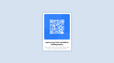
<div class="attribution"> with <main class="attribution">.<div class="head">Improve your front-end skills by building projects</div> with a simple <h1 class="head">Improve...</h1>Code
position: absolute; top: 50%; left: 50%; transform: translate(-50%, -50%); for placing the content in the middle of the screen. Even though it works, it is not the best and easiest way to do it. I would suggest looking into flexbox. If you would like to implement that in your code there are a couple of steps that you have to do:position: absolute; top: 50%; left: 50%; transform: translate(-50%, -50%); from <body>margin: auto; from <div class="attribution>min-height: 100vh; display: flex; justify-content: center; align-items: center. Flexbox just makes it easy to position elements and it's later easier to make it responsive.Here are some useful resources for learning flexbox. Article explaining properties Short video and game to practice flexbox
Overall, great job :) And congratulations on finishing your first challenge! Keep coding, don't give up and good luck with future challenges. Of course, feel free to ask me if you have any questions - here or on slack channel.
Have a great day!
Hi,
good job with the challenge! Here are some small tips if you want to improve your solution:
margin: 10rem auto; your content is centred but it's causing a scroll on smaller screens because the content is too big for it - because of the margin. You can fix that and easily center the div with flexbox. To do that you have to:margin: 10rem auto; from .container and remove margin: 0 auto; from .cardmin-height: 100vh; /*sets the content height to the full size of the screen but will expand when content is bigger */ display: flex; justify-content: center; align-items: centerGenerally using flexbox or grid to center a div is considered to be the best way to center a div.
Let me know if you have any questions and good luck with future challenges :)
Hi,
great job with the challenge :) It looks great. If you want to further improve your solution here are some tips:
Accessibility
Design
.container{ width: 100%; height: 90vh; }
to
.container{ width: 100%; min-height: 90vh; }
Overall, great job.
Keep coding and good luck with the next challenges!
Hi!
Great job with the solution. I really like the end result 🎉
I would only suggest changing small 2 things:
<img class="image" src="./images/icon-sedans.svg" alt=""> You can simply use alt="sedan icon" and it will improve the accessibility.Overall, great job!
All feedbacks are welcome and thanks in advance.
Hi Tushar Pandey,
good job with the challenge! It looks great.
If you want to make it even better here are some suggestions:
Accessibility
<main class="container"> Using HTML landmark elements, such as <header> <nav> <main> <footer> improves accessibility of your site.Design
Overall good job 🎉
Great job! I really like your solution. It look perfect 😊
Hi Ítalo Gabriel, great job with this challenge! It looks awesome. I really like the loading spinner 😊
There are a couple of things that you can improve - they are mostly related to accessibility:
Let me know if you have any questions.
Good luck with next challenges!
all feedback are welcome :)
Hi Tiff,
Good job with this challenge!
If you want to further improve your solution here are some tips:
console.log(data) from the 8th line in app.js file beacuse leaving console.logs are considered a bad practice.Overall, great job!
Keep coding and good luck with future challenges
Hi, Great job 🎉 I really like your solution.
I have only 2 small suggestions for you:
Coded by Your Name Here. with your name 😉 Be proud of your solutionKeep coding and good luck with future challenges!
This was just a small task, although is there anything i could do better?
Hi,
Good job with the solution! It looks just like the design! Here are some minor suggestions if you want to improve your code :)
Accessibility
<p class=headline> could be a <h1> elementVisual aspect
Code
Overall, good job! Let me know if you have any questions
Keep coding and good luck with future challenges!
Hi, Good job with the challenge. You did great :)
2 small suggestions
img\icon-sedans.svg to this: src="./images/icon-sedans.svg")Keep coding and good luck with future challenges
the difficulties were in the responsive design, but the challenge with fun
Hi, Congrats on completing the challenge!
Here are some minor issues that you can fix:
screen and (min-width: 375px) and (max-width: 600px) as it applies the style only to widths between 375-600. Everything lower and higher than these values won't be affected by the styling.Let me know if you have any questions :)
Keep coding and good luck with future challenges