


@hdreddySubmitted over 2 years ago
Latest solutions
Rest Api Countries App - React, SCSS, Framer-Motion, Axios
#framer-motion#react#sass/scss#axiosSubmitted over 2 years ago
Latest comments
- @joaskrPosted over 2 years ago
Hi :)
Good job with the challenge. You did great. If you want to further improve your solution, here are some tips:
Accessibility
- You should use HTML landmark elements such as <main> <header> <nav> <footer> because they improve accessibility. In your code, you can replace
<div class="attribution">with <main class="attribution">. - It is considered a good practice to use h1 on a page. In your case you can replace
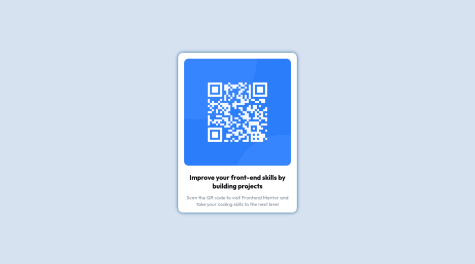
<div class="head">Improve your front-end skills by building projects</div>with a simple<h1 class="head">Improve...</h1>
Code
- I see that you used
position: absolute; top: 50%; left: 50%; transform: translate(-50%, -50%);for placing the content in the middle of the screen. Even though it works, it is not the best and easiest way to do it. I would suggest looking into flexbox. If you would like to implement that in your code there are a couple of steps that you have to do:
- remove
position: absolute; top: 50%; left: 50%; transform: translate(-50%, -50%);from <body> - remove
margin: auto;from <div class="attribution> - Add the following properties to the <body>:
min-height: 100vh; display: flex; justify-content: center; align-items: center. Flexbox just makes it easy to position elements and it's later easier to make it responsive.
- You can also change px to rem/em. It is better for responsiveness to use these units. You can read more about them here
Here are some useful resources for learning flexbox. Article explaining properties Short video and game to practice flexbox
Overall, great job :) And congratulations on finishing your first challenge! Keep coding, don't give up and good luck with future challenges. Of course, feel free to ask me if you have any questions - here or on slack channel.
Have a great day!
Marked as helpful1 - You should use HTML landmark elements such as <main> <header> <nav> <footer> because they improve accessibility. In your code, you can replace
- @mhap75Submitted over 2 years ago@joaskrPosted over 2 years ago
Hi,
good job with the challenge! Here are some small tips if you want to improve your solution:
- If you want to get rid of the accessibility issue you can replace <p>Improve your...</p> with a <h1>. It is considered a good practice to use the main header on a page.
- Because you are using
margin: 10rem auto;your content is centred but it's causing a scroll on smaller screens because the content is too big for it - because of the margin. You can fix that and easily center the div with flexbox. To do that you have to:
- Remove
margin: 10rem auto;from .container and removemargin: 0 auto;from .card - In .container add the following properties:
min-height: 100vh; /*sets the content height to the full size of the screen but will expand when content is bigger */ display: flex; justify-content: center; align-items: center
Generally using flexbox or grid to center a div is considered to be the best way to center a div.
Let me know if you have any questions and good luck with future challenges :)
0 - @Logesh-prSubmitted over 2 years ago@joaskrPosted over 2 years ago
Hi,
great job with the challenge :) It looks great. If you want to further improve your solution here are some tips:
Accessibility
- Wrap your content in a <main> element instead of a <div class="container">. It is best practice to use HTML landmark elements such as <main> <header> <footer> and <nav> because they improve accessibility.
- It is also best practice to have an <h1> on a page. In your case <h3> can be changed to <h1>. Generally, we should use headers in order - so we should start with <h1> then <h2> and then <h3>.
Design
- I noticed a small bug in your solution when you open the website on a mobile device in landscape mode. The content is too big for the screen and looks weird. You can fix it for example by changing:
.container{ width: 100%; height: 90vh; }to
.container{ width: 100%; min-height: 90vh; }Overall, great job.
Keep coding and good luck with the next challenges!
Marked as helpful0 - @William73920Submitted over 2 years ago@joaskrPosted over 2 years ago
Hi!
Great job with the solution. I really like the end result 🎉
I would only suggest changing small 2 things:
- Switch a <div class="attribution"> to a <footer> - it is good for the accessibility to wrap all elements on your page with HTML landmark elements such as <main> <header> <nav> <footer> because it improves accessibility.
- Don't forget about adding an alt text to the images that describe what's in the picture. In your code you left that value empty
<img class="image" src="./images/icon-sedans.svg" alt="">You can simply use alt="sedan icon" and it will improve the accessibility.
Overall, great job!
0 - @TusharPandey98Submitted over 2 years ago@joaskrPosted over 2 years ago
Hi Tushar Pandey,
good job with the challenge! It looks great.
If you want to make it even better here are some suggestions:
Accessibility
- Wrap your content in a <main> tag instead of using a <div> ->
<main class="container">Using HTML landmark elements, such as <header> <nav> <main> <footer> improves accessibility of your site. - You can also replace <h2> with <h1>. Since this is the only header in the solution it fits better to use a <h1>. Also, it is a good practice to have one level one header on a website.
Design
- I noticed a small bug when you open the website on a mobile device in landscape mode - the content is too big for the screen and is only partially visible. You may want to look into that. 😊
Overall good job 🎉
Marked as helpful0 - Wrap your content in a <main> tag instead of using a <div> ->
- @slwestonSubmitted over 2 years ago@joaskrPosted over 2 years ago
Great job! I really like your solution. It look perfect 😊
0