Solution retrospective
Hi community :)
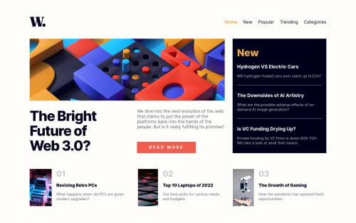
Oh my, that challenge was a lot harder than I expected. I had a lot of trouble making it responsive. I decided to use grid for styling and that was actually the first time that I used grid in a frontend mentor challenge. I tend to stick to Flexbox whenever I can but I wanted to challenge myself. Big kudos to Design Course for this tutorial. It help me understand how to use grid-template-areas.
I'm not fully satisfied with the solution and I will definitely improve but I need to do a couple more sites with grid to get some practice. But you know, practice makes perfekt.
Please log in to post a comment
Log in with GitHubCommunity feedback
No feedback yet. Be the first to give feedback on Joanna Skrzypczak's solution.
Join our Discord community
Join thousands of Frontend Mentor community members taking the challenges, sharing resources, helping each other, and chatting about all things front-end!
Join our Discord