Submitted almost 3 years agoA solution to the Skilled e-learning landing page challenge
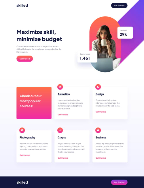
Skilled elearning landing page
@joaskr

Solution retrospective
Hi community,
I had a lot of fun while coding this challenge. I really like how the design looks, especially on mobiles. I like the gradients and colors!
While building the project I had the biggest challenge with positioning the background image on tablet and desktop. Currently I'm using
background-position-x: 50vw;
background-position-y: -150px;
to position it on the right top side of the screen. However, it doesn't look good on all widths and isn't fully responsive. Are there better ways to position it? I'll be thankful for the tips 😊
Have a great weekend everyone!
Code
Loading...
Please log in to post a comment
Log in with GitHubCommunity feedback
No feedback yet. Be the first to give feedback on Joanna Skrzypczak's solution.
Join our Discord community
Join thousands of Frontend Mentor community members taking the challenges, sharing resources, helping each other, and chatting about all things front-end!
Join our Discord