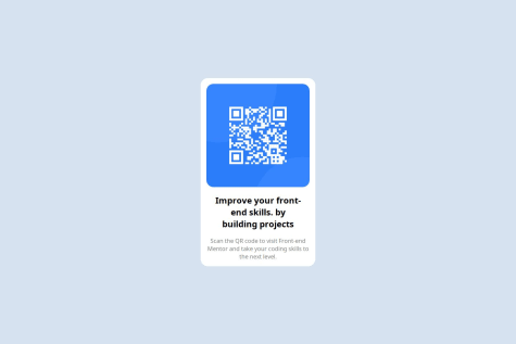
I'm still not comfortable with JS, still need a lot to learn. This project is not finished. I will revisit it tomorrow!
İsmail Hasır
@ismailhasirAll comments
- P@nikolasladicSubmitted 4 months agoWhat specific areas of your project would you like help with?P@ismailhasirPosted 3 months ago
Looks fantastic.Nearly pixel perfect implementation.Congratz for your solution.
0 - @gowthamjk08Submitted 4 months ago
- P@ismailhasirSubmitted 4 months agoP@ismailhasirPosted 4 months ago
Thank you for your time and effort review my code.I will correct my mistakes accordingly to your advices.
0 - P@Richard1876Submitted 4 months agoWhat specific areas of your project would you like help with?
Feedback is welcome
P@ismailhasirPosted 4 months agoYour design matches what asked.Congratulations on your solution.
0 - @BoffdubSubmitted 4 months agoWhat are you most proud of, and what would you do differently next time?
I'm proud that when I was stuck, I was able to look up what to do in a fast and efficient way.
I also saw other projects use root and I thought this was a good opportunity for me to use it.
What challenges did you encounter, and how did you overcome them?The grid was confusing to me (and still is) but I got it to work.
What specific areas of your project would you like help with?I feel like there is something off. I'm not sure what though. I think the font-weights could be better?
P@ismailhasirPosted 4 months agoDimensions and border radius'es could be better.Overall good solution.Congratulation.
1 - P@ismailhasirSubmitted 5 months agoP@ismailhasirPosted 5 months ago
Fantastic feedbacks, thank you!
I will refactor my project tomorrow based on your suggestions again.
0 - @tassistaSubmitted 5 months agoP@ismailhasirPosted 5 months ago
Font size slightly incorrect.Other than that, it is successful replica of the given task.
Congratilations for your work.
0 - @Extendo99Submitted 5 months agoWhat are you most proud of, and what would you do differently next time?
Thanks to the experience gained in previous challenges, this one went quite smoothly.
I am proud of managing the photos so that one is visible on mobile and the other on desktop, depending on the width.
I also managed to manage the price according to the design, which I am proud of.
What challenges did you encounter, and how did you overcome them?I did not encounter any major problems during this challenge.
What specific areas of your project would you like help with?I would like to ask for general advice on the readability of the code, responsiveness and efficiency of my code.
P@ismailhasirPosted 5 months agoPerfume text size and button height little inaccurate. Other than that your solution %99.9 matches what is asked. Congratilations.
1 - @hrid-chakrabortySubmitted 6 months agoP@ismailhasirPosted 6 months ago
Almost perfect implementation.I see no issues at all.Congratilations for your solution.
1 - @djkliveSubmitted 6 months agoWhat are you most proud of, and what would you do differently next time?
I am proud that i was able to complete the solution
What challenges did you encounter, and how did you overcome them?The challenge that i encounter was to place the element inside my profil links but i overcome it with
What specific areas of your project would you like help with?marginpaddingandflexboxI just want help to arrange the element inside th profil links so that it match the design
P@ismailhasirPosted 6 months agoLittle bigger than what asked. This is a minimal error. Other than that it is %99 correct. Congratlulations for your solution.
0 - P@ryanhoran1985Submitted 6 months agoWhat are you most proud of, and what would you do differently next time?
I know it is only the second challenge, but I am proud of how knowledgeable I am with the basics of HTML and CSS. I am self-teaching and while I am struggling a bit with figma and how to get the dimensions correctly, overall I am proud of my progress.
What challenges did you encounter, and how did you overcome them?I am still struggling with figma and will definitely need to watch a tutorial on it, I feel like that is where my scaling problems came in on the first project.
What specific areas of your project would you like help with?Figma
P@ismailhasirPosted 6 months agoUsing list's for this project is a diffirent idea.Design very close to what asked.Maybe user avatar might be little smaller.
Very good work.Congratilations.
0 - @HIGHZIKdcSubmitted 6 months agoWhat are you most proud of, and what would you do differently next time?
I'm proud that i was able to finish the task giving.and i made research on what i didn't understand.
What challenges did you encounter, and how did you overcome them?I had challenges styling my code using CSS,and i was able to overcome it by making research and watching youtube video.
What specific areas of your project would you like help with?CSS positioning and box model


