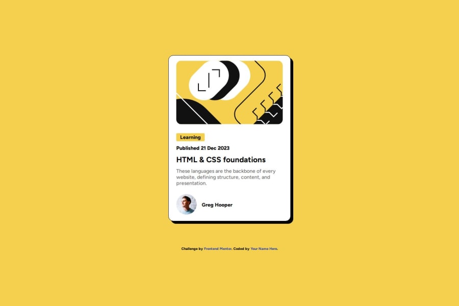
Design comparison
Solution retrospective
I know it is only the second challenge, but I am proud of how knowledgeable I am with the basics of HTML and CSS. I am self-teaching and while I am struggling a bit with figma and how to get the dimensions correctly, overall I am proud of my progress.
What challenges did you encounter, and how did you overcome them?I am still struggling with figma and will definitely need to watch a tutorial on it, I feel like that is where my scaling problems came in on the first project.
What specific areas of your project would you like help with?Figma
Community feedback
- P@ismailhasirPosted 6 months ago
Using list's for this project is a diffirent idea.Design very close to what asked.Maybe user avatar might be little smaller.
Very good work.Congratilations.
0
Please log in to post a comment
Log in with GitHubJoin our Discord community
Join thousands of Frontend Mentor community members taking the challenges, sharing resources, helping each other, and chatting about all things front-end!
Join our Discord
