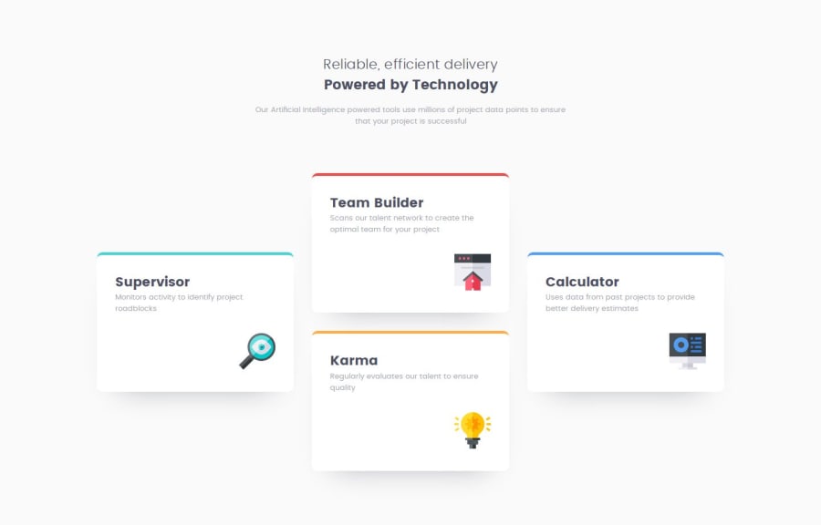
Design comparison
Community feedback
- @AdrianoEscarabotePosted 6 months ago
Hello tassista, how are you? I was really pleased with your project, but I’d like to offer some advice that might help:
You have used <br> , using <br> is not only bad practice, it is problematic for people who navigate with the aid of screen reading technology. Screen readers may announce the presence of the element. This can be a confusing and frustrating experience for the person using the screen reader.
The rest is spot on.
Hope it’s helpful to you. 👍
0@tassistaPosted 6 months agothx for the advice...I overlooked it...beginner's stuff like am I... :)
1 - P@ismailhasirPosted 6 months ago
Font size slightly incorrect.Other than that, it is successful replica of the given task.
Congratilations for your work.
0
Please log in to post a comment
Log in with GitHubJoin our Discord community
Join thousands of Frontend Mentor community members taking the challenges, sharing resources, helping each other, and chatting about all things front-end!
Join our Discord
