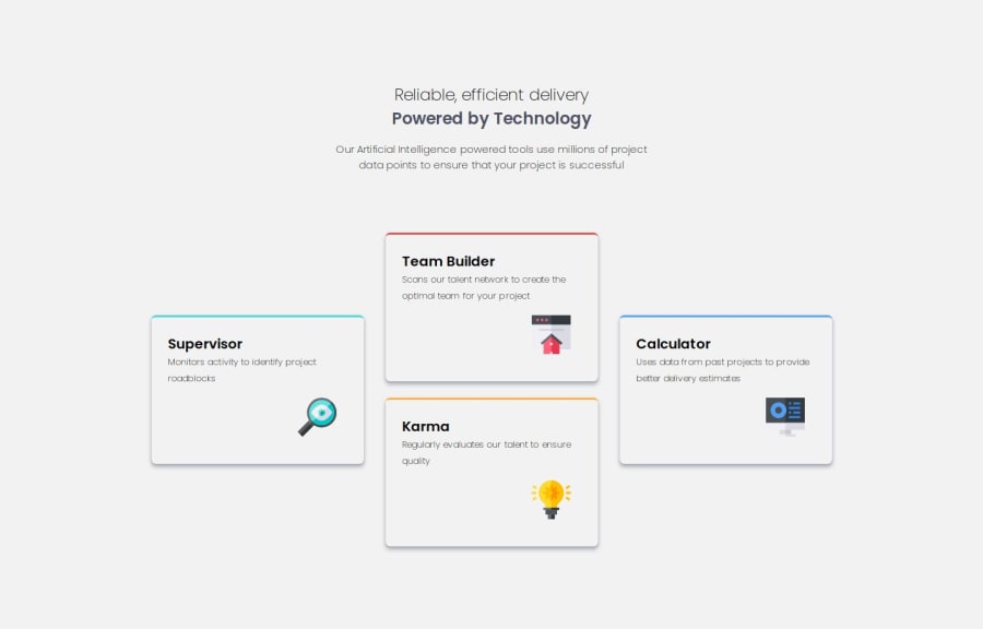
Design comparison
Community feedback
- P@ismailhasirPosted 5 months ago
Fantastic feedbacks, thank you!
I will refactor my project tomorrow based on your suggestions again.
0 - @brukmgPosted 5 months ago
Hey, awesome job on using CSS variables! It's great to see you applying them so well it makes your code cleaner and more maintainable. Keep up the good work, you're definitely getting the hang of this! Just a few small tweaks here and there, and you'll be on your way to writing even more efficient code. Well done!
- Starting with the folder structure, it would be better to place
styles.cssin its own folder. - Focusing on semantic elements like
header,main, andfooterimproves your site’s readability, accessibility, and SEO-friendliness. - There's no need to set a
widthfor thebodyelement since it fills the viewport by default. - The color
#f2f2f2is being used as thebackground-color, but it's not part of the design. - There are redundant styles for the card’s top border; you could use
border-top: 3px solidin.cardand apply a different color for each card. - For better visual impact, increase the blur of the card shadow.
- Only one media query is implemented. What about the other screen sizes?
0 - Starting with the folder structure, it would be better to place
Please log in to post a comment
Log in with GitHubJoin our Discord community
Join thousands of Frontend Mentor community members taking the challenges, sharing resources, helping each other, and chatting about all things front-end!
Join our Discord
