Not Found
Not Found
Not Found
Not Found
Not Found
Not Found
Not Found
Not Found
Not Found
Not Found
Not Found
Not Found
Not Found
Not Found
Not Found
Not Found
Not Found
Not Found
Not Found
Not Found

Submitted

Product-preview-card-component using Flexbox

Extendo99 60

@Extendo99

Desktop design screenshot for the Product preview card component coding challenge

This is a solution for...

  • HTML
  • CSS
1newbie
View challenge

Design comparison


SolutionDesign

Solution retrospective


What are you most proud of, and what would you do differently next time?

Thanks to the experience gained in previous challenges, this one went quite smoothly.

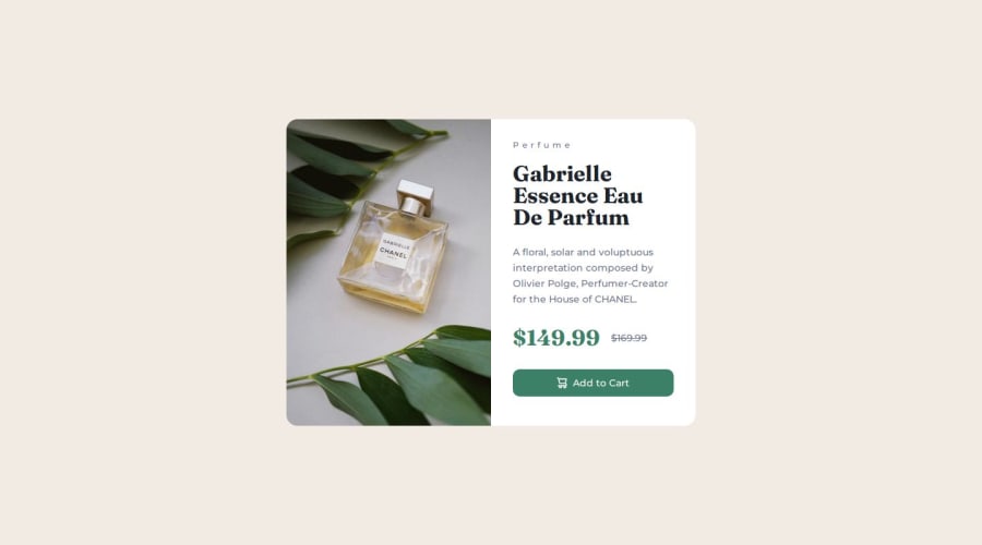
I am proud of managing the photos so that one is visible on mobile and the other on desktop, depending on the width.

I also managed to manage the price according to the design, which I am proud of.

What challenges did you encounter, and how did you overcome them?

I did not encounter any major problems during this challenge.

What specific areas of your project would you like help with?

I would like to ask for general advice on the readability of the code, responsiveness and efficiency of my code.

Community feedback

Adriano 36,730

@AdrianoEscarabote

Posted

Hi Extendo99, how’s everything? I think your project turned out great! However, I have some feedback that I think might be useful:

Use the THE PICTURE TAG that is a shortcut to deal with the multiple images in this challenge. So you can use the <picture> tag instead of importing this as an <img> or using a div with background-image. Use it to place the images and make the change between mobile and desktop, instead of using a div or img and set the change in the css with display: none with the tag picture is more practical and easy. Note that for SEO / search engine reasons isn’t a better practice import this product image with CSS since this will make it harder to the image. Manage both images inside the <picture> tag and use the html to code to set when the images should change setting the device max-width depending of the device desktop + mobile.

Check the link for the official documentation for <picture> in W3 SCHOOLS: https://www.w3schools.com/tags/tag_picture.asp

See the example below:

<picture>
  <source media="(max-width:650px)" srcset="./images/image-product-mobile.jpg">
  <img src="./images/image-product-desktop.jpg" alt="Gabrielle Parfum" style="width:auto;">
</picture>

The rest is amazing.

I hope this is helpful. 👍

Marked as helpful

1
P

@ismailhasir

Posted

Perfume text size and button height little inaccurate. Other than that your solution %99.9 matches what is asked. Congratilations.

1

Extendo99 60

@Extendo99

Posted

Thank you for feedback :) @ismailhasir

0

Please log in to post a comment

Log in with GitHub
Discord logo

Join our Discord community

Join thousands of Frontend Mentor community members taking the challenges, sharing resources, helping each other, and chatting about all things front-end!

Join our Discord