Skip to content
Learning paths
Challenges
Solutions
Articles
Unlock Pro
Log in with GitHub
Profile
Overview
Solutions
19
Comments
0
golfingtrex
@golfingtrex
Follow
All solutions
Submitted about 1 year ago
Chat App
HTML
CSS
0
3
0
Submitted about 1 year ago
Another Huddle
HTML
CSS
0
4
1
Submitted over 1 year ago
Fylo Landing Page 2
HTML
CSS
0
1
0
Submitted over 1 year ago
Huddle Landing Page 2
HTML
CSS
0
0
0
Submitted over 1 year ago
Clipboard Landing Page
HTML
CSS
0
3
0
Submitted over 1 year ago
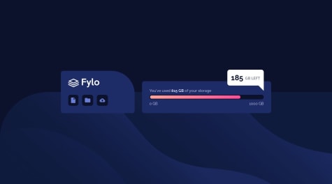
Fylo Data Storage
HTML
CSS
0
3
0
Submitted over 1 year ago
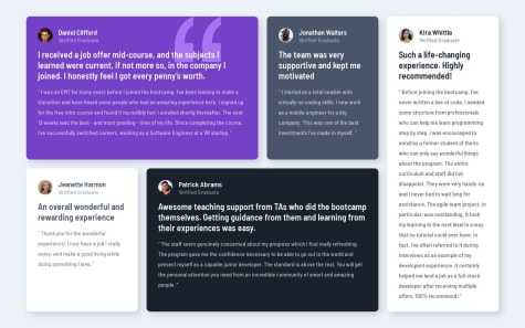
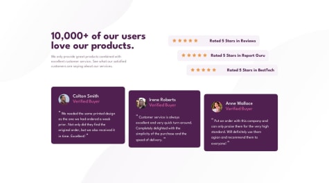
Testimonials Grid
HTML
CSS
0
4
0
Submitted over 1 year ago
Huddle Landing Page
HTML
CSS
0
4
0
Submitted over 1 year ago
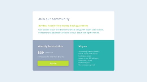
Single Price Grid Component
HTML
CSS
0
5
0
Submitted over 1 year ago
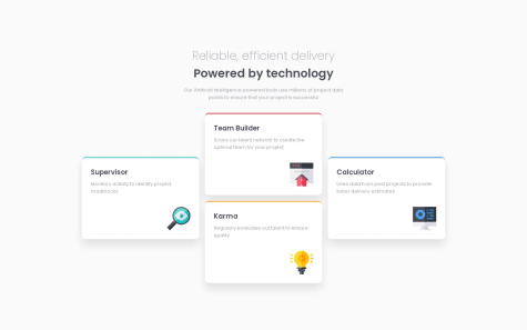
4 Card Feature Section
HTML
CSS
0
5
0
Submitted over 1 year ago
Social Proof
HTML
CSS
0
5
0
Submitted over 1 year ago
Profile Card
HTML
CSS
0
4
0
Submitted over 1 year ago
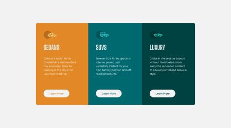
3-Column Preview
HTML
CSS
1
5
0
Submitted over 1 year ago
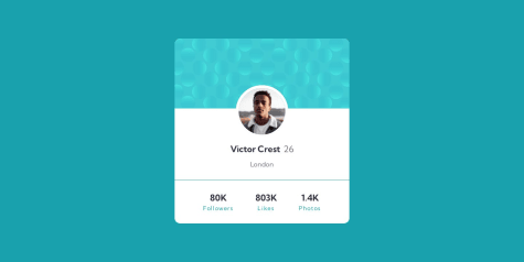
Stats Preview Card
HTML
CSS
0
3
0
Submitted over 1 year ago
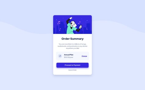
Product Summary Card
HTML
CSS
1
5
0
Submitted over 1 year ago
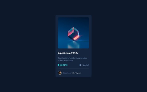
NFT Card
HTML
CSS
1
5
1
Submitted over 1 year ago
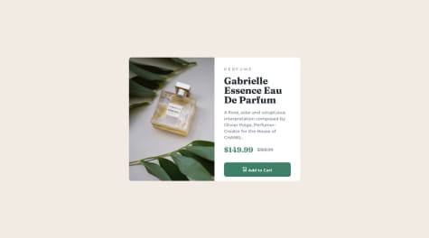
Perfume Product Card
HTML
CSS
0
7
0
Submitted over 1 year ago
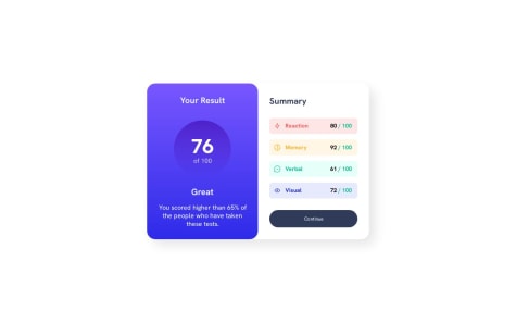
Results Summary
HTML
CSS
0
6
0
Submitted over 1 year ago
QR Code Initial Challenge
HTML
CSS
1
5
0