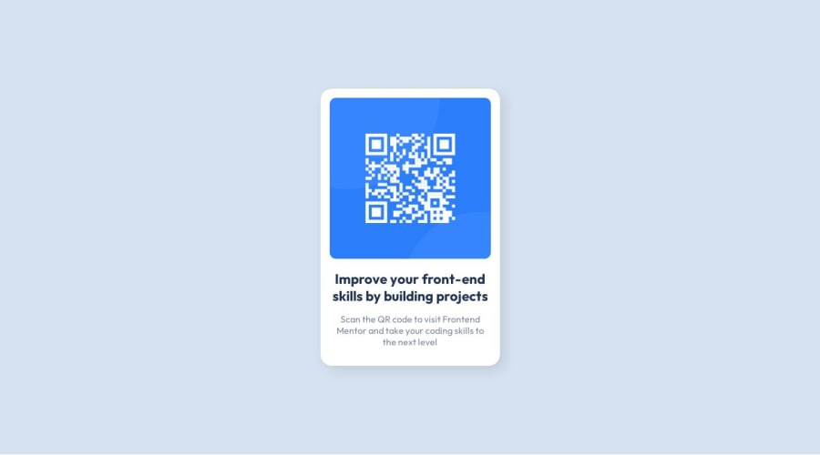
Design comparison
Solution retrospective
I tried to make my HTML as semantic as I could and not just spam divs. Please let me know if there are any noobie mistakes or optimizations I can do in either my HTML or my CSS. Thank you!
Community feedback
- @rinsterPosted over 1 year ago
Hi! Amazing job on completing this!
To make this accessible, you'll need to wrap your
.container
element with semantic HTML tags<main></main>
Also, all images should have the
alt
attribute filled in so screen readers are able to describe images.A great resource on semantic elements can be found here: https://www.w3schools.com/html/html5_semantic_elements.asp If you'd like to deepen your knowledge of accessibility, Udacity offers a free web accessibility course: https://www.udacity.com/course/web-accessibility--ud891
0@golfingtrexPosted over 1 year ago@rinster I don't know how, but I linked the wrong github repo for this project... should be updated now.
0
Please log in to post a comment
Log in with GitHubJoin our Discord community
Join thousands of Frontend Mentor community members taking the challenges, sharing resources, helping each other, and chatting about all things front-end!
Join our Discord