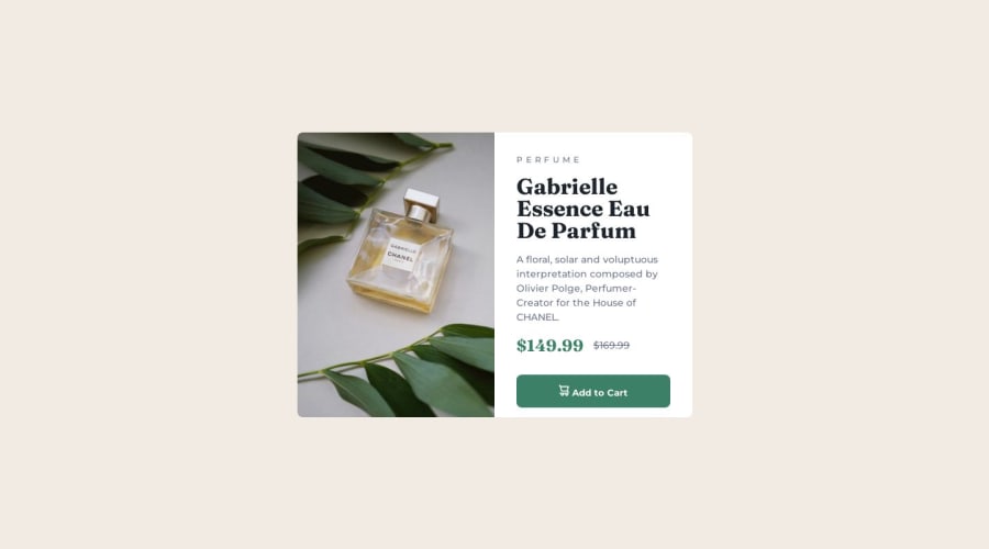
Design comparison
SolutionDesign
Solution retrospective
There are a few minor things I didn't bother with, like the spacing between the SVG and the text on the button. I'm using flexbox a lot for these types of challenges but please let me know if I should be taking a different approach, or if you have any tips on how to improve my use of flexbox. I tried to stay away from hard-coded values but sometimes it seems like it's necessary. I appreciate any feedback you may have, thank you!
Community feedback
Please log in to post a comment
Log in with GitHubJoin our Discord community
Join thousands of Frontend Mentor community members taking the challenges, sharing resources, helping each other, and chatting about all things front-end!
Join our Discord
