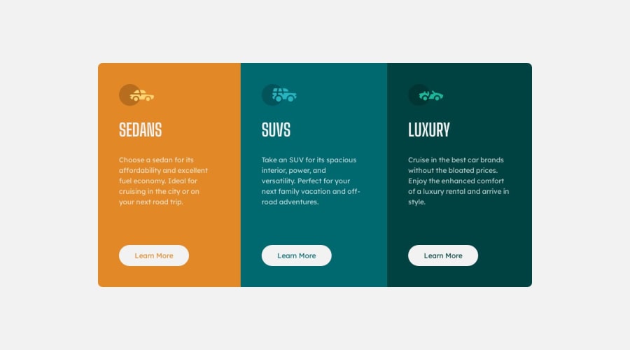
Design comparison
SolutionDesign
Solution retrospective
Attempt at making my pages more responsive. Used breakpoints listed in Edge as reference. Only bothered with making it nice for 1440px and 375px, but the code is there for each breakpoint. Please let me know any improvement I can make. Thank you!
Community feedback
- @0xabdulkhaliqPosted over 1 year ago
Hello there 👋. Congratulations on successfully completing the challenge! 🎉
- I have other recommendations regarding your code that I believe will be of great interest to you.
HEADINGS ⚠️:
- This solution consists incorrect usage of
<h1>so it can cause severe accessibility errors due to incorrect usage of level-one headings<h1>
- Every site must want only one
h1element identifying and describing the main content of the page.
- An
h1heading provides an important navigation point for users of assistive technologies, allowing them to easily find the main content of the page.
- In this solution there's three
<h1>elements, like this<h1>SEDANS</h1>, you can preferably use<h2>instead of<h1>. Remember<h1>provides an important navigation point for users of assistive technologies so we want to use it wisely
- So we want to add a level-one heading to improve accessibility by reading aloud the heading by screen readers, you can achieve this by adding a
sr-onlyclass to hide it from visual users (it will be useful for visually impaired users)
- Example:
<h1 class="sr-only">3-column preview card component</h1>
- If you have any questions or need further clarification, you can always check out
my submissionfor this challenge where i used this technique and feel free to reach out to me.
.
I hope you find this helpful 😄 Above all, the solution you submitted is great !
Happy coding!
0
Please log in to post a comment
Log in with GitHubJoin our Discord community
Join thousands of Frontend Mentor community members taking the challenges, sharing resources, helping each other, and chatting about all things front-end!
Join our Discord
