

Design comparison

Solution retrospective
Trying to avoid hard-coding pixel values except for border-radius. Had some trouble getting the background image to work properly so that it would shift when the viewport is resized. Works pretty well but maybe there's a better way? Any criticism is welcome. Thank you!
Community feedback
- @vanzasetiaPosted over 1 year ago
Hello there! 👋
I recommend using the mobile background pattern for mobile screen sizes. After that, use a media query to change it to the desktop background pattern. This can solve the issue.
A few suggestions for improvements.
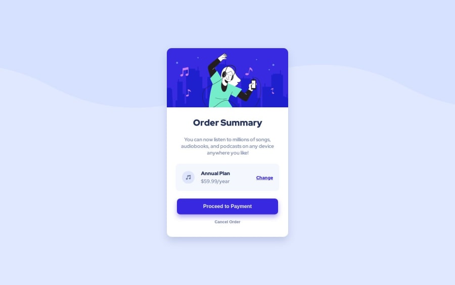
- The illustration and the music icon are decorative images. So leave the alternative text empty.
- For your information, decorative images are images that do not add any information and serve only aesthetic purposes.
- Use
<p>element for the price instead of<h3>. <button>element must always havetypeattribute to prevent unexpected behavior. Source: Checklist - The A11Y Project #use-the-button-element-for-buttons- Remove
<section id="order_summary">. Make the<body>element a flex container of the card. Use the<main>element for the card. This way, you do not need an extra markup. - Use
remoreminstead ofpxfor font sizes. Never usepxunit. Relative units such asremandemcan adapt when the users change the browser's font size setting. Learn more — Why you should never use px to set font-size in CSS - Don't use
idselectors for styling. There are two reasons for not using ID’s to style content: - They mess up specificity because they are too high (the most important reason).
- They are unique identifiers. So, they are not reusable on the same page.
- Learn more — What the ID attribute is REALLY for
I hope this helps. Happy coding! 😄
Marked as helpful0@golfingtrexPosted over 1 year ago@vanzasetia Thank you for the feedback, I really appreciate it.
A few justifications for some of my decisions:
-
Using px for font size is a bad idea, I agree. However, the style guide explicitly says to use 16 px in the
<p>tag. This is also why I used<h3>for price. -
I purposefully used the
<section id="order_summary">. My thinking was to have a section as a container for other product cards. This is not specifically required for this project in particular, it was more for my own learning and design practice, though I may remove it in the future.
I especially appreciate the tip about not using styling for
idselectors. You can see in my code that I had to use!importantin order to get desired effect, sinceidhas higher precedence overclass.Thanks again, very helpful.
0@vanzasetiaPosted over 1 year ago@golfingtrex
You are welcome! I am happy that you found my suggestions to be helpful.
About your decisions:
- The style guide is just a guide. Your code is the source of the truth. So to make it responsive you should use
remunit instead ofpxunit. - Do not use heading tags for the sake of font size. They have a meaning which is to structure the content of your page. Think of heading tags as titles and sub-titles on a book. Learn more about heading elements — How-to: Accessible heading structure - The A11Y Project
Marked as helpful0

Please log in to post a comment
Log in with GitHubJoin our Discord community
Join thousands of Frontend Mentor community members taking the challenges, sharing resources, helping each other, and chatting about all things front-end!
Join our Discord