Design comparison
SolutionDesign
Solution retrospective
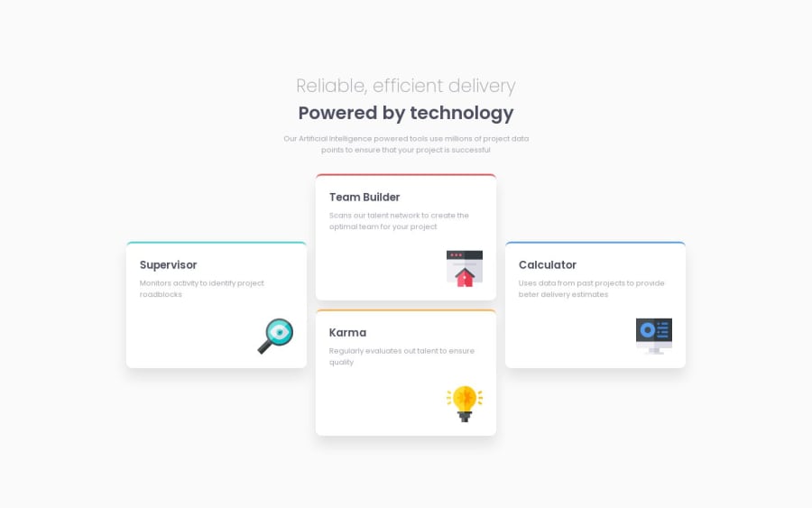
Not perfect. I didn't know how to replicate the top border so mine is a bit different. I had some trouble with this one... first I tried using grid but there were small things that were making it more difficult than it should have been IMO so I switched to flexbox. I also ignored mobile for time's sake. Will likely revisit this challenge in the future. Please lmk what I can do to make this better, thank you!
Community feedback
Please log in to post a comment
Log in with GitHubJoin our Discord community
Join thousands of Frontend Mentor community members taking the challenges, sharing resources, helping each other, and chatting about all things front-end!
Join our Discord
