
@peta-8-bitSubmitted over 2 years ago

Fidel Lim
@fidellimAll comments
- @fidellimPosted over 2 years ago
Hi @Petabyte,
Congrats on finishing the project!
To remove the white background color below your image, you could just set your image tag as a block.
.image img {
    display: block;
    width: 300px;
    border-radius: 10px 0px 0px 10px;
}
The code above should fix that issue.
If you are also interested in removing the warning on your accessibility report, you can add this block of code:
<div class="attribution">
    Challenge by <a href="https://www.frontendmentor.io?ref=challenge" target="_blank">Frontend Mentor</a>.
    Coded by <a href="https://www.frontendmentor.io/profile/peta-8-bit">Petabyte</a>.
  </div>
inside a
<footer>tag.Let me know if it works!
Marked as helpful1 - @funficientSubmitted over 2 years ago@fidellimPosted over 2 years ago
Hi Kate,
Congrats on your first Frontend Mentor challenge!
Just as a suggestion regarding the accessibility report, you can fix that by adding semantic tags such as
<section>or<main>. Inside the tag, you can include everything you have written inside your<body>tag.You can further have a look at semantic tags here
Then, you can resubmit your project to check if the warnings are gone.
Hope it helps!
0 - @macpozSubmitted over 3 years ago@fidellimPosted over 3 years ago
Hi @macpoz,
Great job finishing the project! It looks great on desktop and mobile devices. Well done! :)
0 - @khasTemaSubmitted over 3 years ago@fidellimPosted over 3 years ago
Hi @khasTema,
Great job finishing your first project in Frontend Mentor! It looks great on desktop and mobile devices. You can have a look at your report to get an idea of some issues (accessibility/HTML) you could fix! Well done!
0 - @Art-wdtSubmitted over 3 years ago@fidellimPosted over 3 years ago
Hi @Art-wdt,
Great job finishing the project! It looks great on desktop and mobile devices. I like it. Well done! You can implement the form validation using JS next time once you are learning it. Also, you can have a look at your report to have an idea of what other issues you could fix. :)
Marked as helpful1 - @othmanbenhamdouneSubmitted over 3 years ago@fidellimPosted over 3 years ago
Hi @othmanbenhamdoune,
Great job finishing the project! You can try adding the two circles to your background to challenge yourself. Also, it is included in the design. This will be great practice!
Marked as helpful1 - @Tariqul-hudaSubmitted over 3 years ago@fidellimPosted over 3 years ago
Hi @Tariqul-huda,
You can learn Semantic tags with these links: MDN and w3schools.
To increase mentor score, you can give feedback to other develops by commenting on their work (challengers they did). You could also finish challenges. You can a specific point depending on the difficulty of the challenge.
Marked as helpful1 - @Nana-Kwame247Submitted over 3 years ago@fidellimPosted over 3 years ago
Hi @Nana-Kwame247,
Great job finishing the project! It looks great on desktop and mobile devices. Some suggestions I would like to share are of the following:
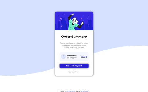
- you can put the background image in an img tag instead and set the width to 100% so that there are no spaces left.
- you can add some margin on your component so that there is some space in mobile view.
- you can add
align-items: center;on the.payment-planclass so that the music icon does not look stretched. - you can add this code to your component so that it does adapt to the screen width when it decreases:
.hero-image {
    max-width: 28rem;
    width: 100%;
    border-top-left-radius: 1rem;
    border-top-right-radius: 1rem;
}
I hope these help :)
1 - @markfalcutilaSubmitted over 3 years ago@fidellimPosted over 3 years ago
Hi @markfalcutila ,
Great job finishing the project! It looks great on desktop and mobile devices. Some suggestions I would like to share are of the following:
- you don't need to include attribute type on the button tag especially when the type is empty.
- you can include h2-h6 elements inside a section element.
I hope this helps :)
Marked as helpful0 - @Nabil-YSubmitted over 3 years ago@fidellimPosted over 3 years ago
Hi @Nabil-Y,
Great job finishing the project! It looks great on desktop and mobile devices. There is just something weird with the layout of your testimonials between 807px and 1310px. Other than that it looks great! Well done :)
Marked as helpful1 - @JavierMussoSubmitted over 3 years ago@fidellimPosted over 3 years ago
Hi @Stygan,
Great job finishing the project! It looks great on desktop and mobile devices. Well done :)
1 - @leonardo9245Submitted over 3 years ago@fidellimPosted over 3 years ago
Hi @leonardo9245,
Great job finishing the project! It looks great on desktop and mobile devices. Some suggestions I would like to share are of the following:
- you can add
cursor: pointeron your logo as it is usually a link to your home page. - you can add some hover and active effects on other interactive elements.
I hope these help :)
Marked as helpful1 - you can add
- @saykeedSubmitted over 3 years ago@fidellimPosted over 3 years ago
Hi @saykeed,
Great job finishing the project! It looks great on desktop and mobile devices. Some suggestions I would like to share are of the following:
- you can add some padding on your footer during the mobile view to more space on its content
- you can expand the background image of the landing page as its width is not 100%
- you can have a look at your report to have a look at issues you can improve on
I hope these help :)
Marked as helpful0 - @rafo38khSubmitted over 3 years ago@fidellimPosted over 3 years ago
Hi @rafo38kh,
Great job finishing the project! It looks great on desktop and mobile devices. Well done!
Marked as helpful0 - @letyoursoulgloSubmitted over 3 years ago@fidellimPosted over 3 years ago
Hi @letyoursoulglo,
Great job finishing the project! You might have a look at your project as it is not responsive for 1400px and above. I thought there was some bug but it should be some CSS error. I hope it helps :)
1 - @JavierMussoSubmitted over 3 years ago@fidellimPosted over 3 years ago
Hi @Stygan ,
Great job finishing the project! It looks great on desktop and mobile devices. Well done :)
1 - @samiUllah1526Submitted over 3 years ago@fidellimPosted over 3 years ago
Hi @samiUllah1526,
Great job finishing the project! It looks great on desktop and mobile devices. Some suggestions I would like to share are of the following:
- you can add a margin to your component so that it has some breathing room when it is in mobile view.
- Heading tags are not in order. This is important for assistive technology users to navigate the website. Make sure not to skip a heading tag. For instance, if you have h3, there must be h2, and h1 within your markdown.
- image tags cannot have a type.
<img type=iconsrc=./images/icon-music.svg>you should remove type on this code. Don't forget to add some alt property too.
I hope these helps :)
Marked as helpful0 - @HualDevSubmitted over 3 years ago@fidellimPosted over 3 years ago
Hi @Hualdop,
Great job finishing the project! You might want to adjust the media query of your component as there are instances wherein the component doesn't fit the screen width. Also, try to integrate some semantic tags on your HTML file. This will help you understand what the markdown does. So, if you want to have a look at your code later on, you will be able to understand it easily. I hope these help :)
Marked as helpful0