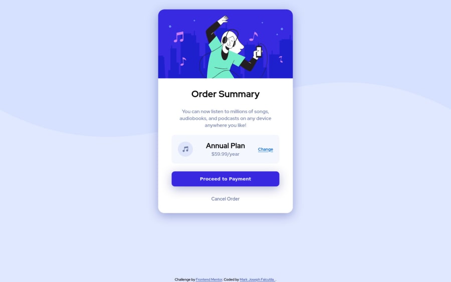
Design comparison
SolutionDesign
Solution retrospective
Hello let me know what you think about my codes? And if you have any advice to improve it or any kind of feedback don't hesitate to tell me. Thankyou!
Community feedback
- @fidellimPosted over 3 years ago
Hi @markfalcutila ,
Great job finishing the project! It looks great on desktop and mobile devices. Some suggestions I would like to share are of the following:
- you don't need to include attribute type on the button tag especially when the type is empty.
- you can include h2-h6 elements inside a section element.
I hope this helps :)
Marked as helpful0
Please log in to post a comment
Log in with GitHubJoin our Discord community
Join thousands of Frontend Mentor community members taking the challenges, sharing resources, helping each other, and chatting about all things front-end!
Join our Discord
