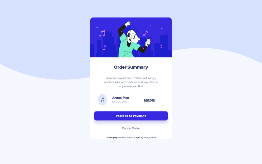
Design comparison
Solution retrospective
Hi guys this is my first project and I would really appreciate any feedback. Thank you very much
Community feedback
- @fidellimPosted over 3 years ago
Hi @Nana-Kwame247,
Great job finishing the project! It looks great on desktop and mobile devices. Some suggestions I would like to share are of the following:
- you can put the background image in an img tag instead and set the width to 100% so that there are no spaces left.
- you can add some margin on your component so that there is some space in mobile view.
- you can add
align-items: center;on the.payment-planclass so that the music icon does not look stretched. - you can add this code to your component so that it does adapt to the screen width when it decreases:
.hero-image {
    max-width: 28rem;
    width: 100%;
    border-top-left-radius: 1rem;
    border-top-right-radius: 1rem;
}
I hope these help :)
1 - @Nana-Kwame247Posted over 3 years ago
Hi @fidellim , thank you so much for your comments. I read your comments exactly a week ago and I implemented everything you said except I can seem to be able to use the background image as image tag. I have tried everything , changed the code three time I just can't figure it out, that is why my reply is coming late.
0
Please log in to post a comment
Log in with GitHubJoin our Discord community
Join thousands of Frontend Mentor community members taking the challenges, sharing resources, helping each other, and chatting about all things front-end!
Join our Discord
