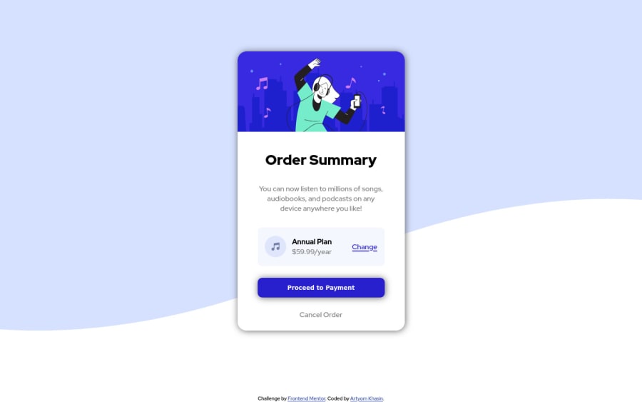
Design comparison
SolutionDesign
Solution retrospective
This is my first attempt so any feedback is appreciated
Community feedback
- @Juveria-DalviPosted over 3 years ago
Use semantic tags like main and footer for better accessibility
<body>
<main>
    <div class="summary-card">
        <div class="summary-card_hero"></div>

       <div class="summary-card_main">
            <h1>Order Summary</h1>
            <p>You can now listen to millions of songs, audiobooks, and podcasts on any
            device anywhere you like!</p>
            <div class="summary-card_plan-info">
                <img src="images/icon-music.svg" alt="music key icon">
                <div class="plan-info_description">
                    <h2>Annual Plan</h2>
                    <span>$59.99/year</span>
                </div>
                <a href="#" class="change-link">Change</a>
            </div>
            <button class="proceed-btn">Proceed to Payment</button>
            <a href="#" class="cancel-btn">Cancel Order</a>
       </div>

    </div>
</main>
  <footer>
  <div class="attribution">
    Challenge by <a href="https://www.frontendmentor.io?ref=challenge" target="_blank">Frontend Mentor</a>.
    Coded by <a href="https://github.com/khasTema" target="_blank">Artyom Khasin</a>.
  </div>
</footer>
</body>
Marked as helpful0 - @fidellimPosted over 3 years ago
Hi @khasTema,
Great job finishing your first project in Frontend Mentor! It looks great on desktop and mobile devices. You can have a look at your report to get an idea of some issues (accessibility/HTML) you could fix! Well done!
0
Please log in to post a comment
Log in with GitHubJoin our Discord community
Join thousands of Frontend Mentor community members taking the challenges, sharing resources, helping each other, and chatting about all things front-end!
Join our Discord
