@jeissongomezdevSubmitted over 2 years ago
All feedback will be well received. Thanks!

All feedback will be well received. Thanks!
Hi, nice approach, here's my feedback
-I'll sugest bit faster animation because, as an user, it just feel too much time xD
-Missing desktop version 1140 - 1440px ++
I had difficulty with the positioning issue.
-Add font family as requested in design
-Check the mobile version as it doesnt work properly.
Dont be shy to look at youtube to increase knowledge, in order to improve and transfer that to your own projects.
All feedback welcome
Strongly recommend you to follow this tutorial, to learn in deep how to approach the task
https://www.youtube.com/watch?v=5BBYPntB-GY
Maqueda solo en HTML5 Y CSS3 usando de ayuda flex
-Bien, muy buen trabajo. De todos modos, te puedo dar dos pequeños consejos visuales para cambiar el 99% de tu trabajo por un 100%
Echa un vistazo a esto en el archivo de estilo:
-Incluir esta única propiedad en .target .bnt-payment
cursor: pointer;
-AGREGAR propiedades Hover y Active al botón de pago con estas 2 propiedades completas:
.target .bnt-payment:hover { transform: translate(-1px, -1px); }
.target .bnt-payment:active { transform: translate(1px, 1px); }
Como último consejo, ya de forma 'personal' me gustaría recomendar cambiar el @media de 1440px a 1140px. En mi caso especifico, no pude percibir nada del 1440 a full window si no fue por herramienta de desarrollador. (Claro, debido a que mi anchura no llega hasta allá) Me parece algo mas 'normal user friendly' usar dicha resolución
Good approach, here's a couple of things to pulish in orden to get design as good as needed.
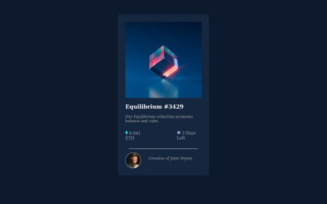
-Try to add :hover attributes as it needs, in the img (as an overlay), EQ name and creator's name
-Add missing font style
-Some revitions to design colors and border-radius to card and img
Open to feedbacks
Nice approach to resolution. Its almost perfect but to reach the 100% proyect i'll recommend to remove the footer and style attriubution that style the footer, at the index.
Also, i've seen in the actual web project, that u fixed the width problem. Nice job.
Finally, try to tabulate your index file properly for better 'fast-approach'
Hi, the goal of the exercise its trying to approach the design as much as possible, that's why i want to give u some feedback.
-Most important: Try to resize your web card page, and you will notice everything goes bad so, my advice its to re-do the visual BASED on the mobile design first principals(part of the excercise)
-Start the style-file code with this, to improve performance and web window usage (removing margins and unnecessary items by default in the browsers)
*{ box-sizing: border-box; margin: 0; padding: 0; }
Hi, here's some advices (to approach design):
-Give some air to the content with padding / margin attributes
-Change font weight and colors properly -Delete footer
-Equilibrium #3429 need to change on hover, not only #3429
About ur code, try to tabulate and organizate a bit more, you can improve the style-file by using :root variables instead of writing / copy pasting colors everytime.
EX:
:root{ /*neutral colors*/ --Very-dark-blue-main-BG: hsl(217, 54%, 11%); --Very-dark-blue-card-BG: hsl(216, 50%, 16%); }
.container { background-color: #0d1a2d; }
goes to
.container { background: var(--Very-dark-blue-main-BG); }
I'd love to hear any feedback to improve
Taking appart some visual height*width differences between solution and design guide (wich can be easily fixed), I do encorage you to take a look at this 4 little things:
-Remove the footer completely (<div class="attribution">)
-Add <a href hover animations (to change color) as design says. In the img(overlay), item name (Equilibrium) and creator name.
-Research about box-shadow (https://cssgenerator.org/box-shadow-css-generator.html) because there is a little box-shadow in the card design.
You can do this by creating a new style with the generator content and add tag to div name.
ex: style-file = .shadow{CONTENT} /// index-file = <section class="card shadow">
-Add alt attribute to sections too.
Also you need to be congratulated, because i saw you code and its beautifully written / structured:: Easy to understand to anyone that want to give further advice.
EDIT: Mobile experience feels kinda 'weird' because card overpass the window height. Try to add this attributes to your style-file; It does center and improve resolution, but will comprese ur card and will need to re-adjust all code sizes to look good. Its up to you.
-Add to body:
display: flex; justify-content: center; align-items: center; width: 100vw; height: 100vh;
-And this full content
*{ box-sizing: border-box; margin: 0; padding: 0; }
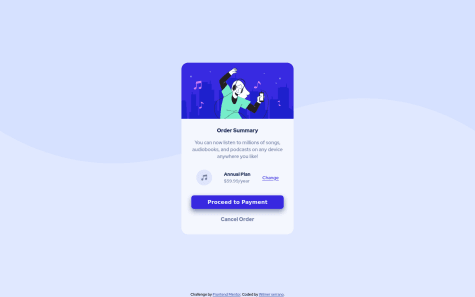
Try to look at payment box, it have a box-shadow underneath. Try to add and everything would be perfect at visual.
By the code, at least try to split style from index (it should be in other folder, but if its on root its not a problem for now) and tabulate the code to better comprehension.
Finally, take a look to ACCESSIBILITY ISSUES, caused for not add the 'alt' attribute to images or icons.
You need to link the font at the index head or the font declaration in the style won't work. Its with the sans-serif default font atm.
Also, try to use :root statements for variables like color / font that are in constant use, to avoid copy paste or write them everytime.
I saw that there is a box-shadow in this project, but i didn't know to replicate it.
What should have I done?
I just noticed that, and looks so weird to be a feature. Anyway, i did something to 'add' that Try to use this web app to create the shadow blur effect that you want.
https://html-css-js.com/css/generator/box-shadow/
Then, copy the css code that gives you and put it on a new .shadow class in the style. Finally, add shadow class to your container class in the main
Ex: <div class="container"> turns into ---- <div class="container shadow">