Design comparison
SolutionDesign
Community feedback
- @dratinixgithubPosted over 2 years ago
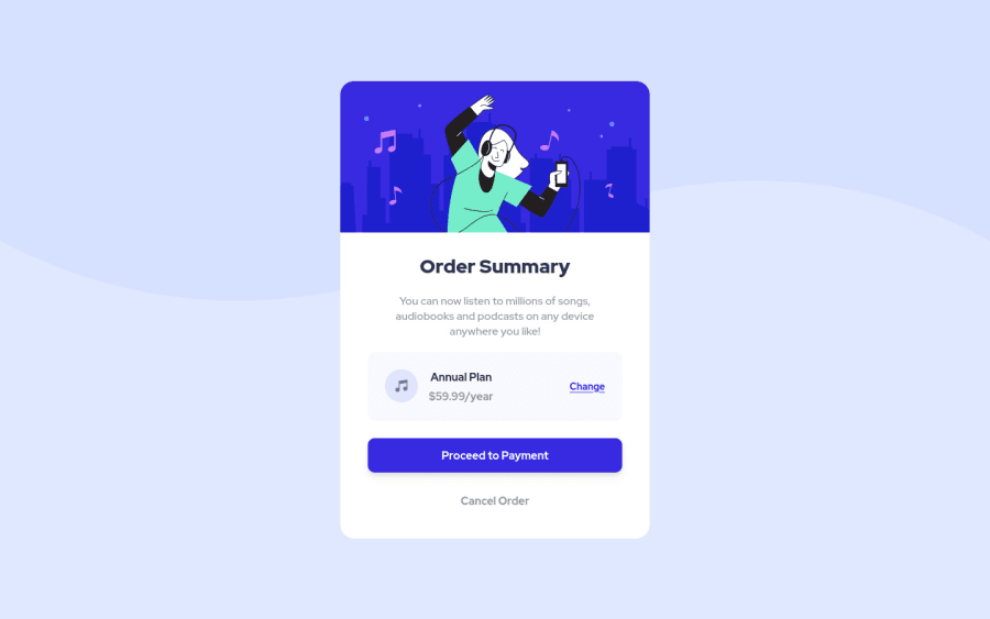
Try to look at payment box, it have a box-shadow underneath. Try to add and everything would be perfect at visual.
By the code, at least try to split style from index (it should be in other folder, but if its on root its not a problem for now) and tabulate the code to better comprehension.
Finally, take a look to ACCESSIBILITY ISSUES, caused for not add the
'alt'attribute to images or icons.Marked as helpful0
Please log in to post a comment
Log in with GitHubJoin our Discord community
Join thousands of Frontend Mentor community members taking the challenges, sharing resources, helping each other, and chatting about all things front-end!
Join our Discord
