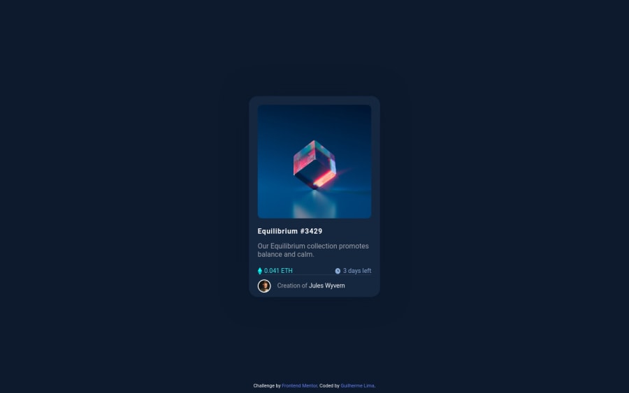
Design comparison
Community feedback
- @dratinixgithubPosted over 2 years ago
Hi, here's some advices (to approach design):
-Give some air to the content with padding / margin attributes
-Change font weight and colors properly -Delete footer
-Equilibrium #3429 need to change on hover, not only #3429
About ur code, try to tabulate and organizate a bit more, you can improve the style-file by using :root variables instead of writing / copy pasting colors everytime.
EX:
:root{ /*neutral colors*/ --Very-dark-blue-main-BG: hsl(217, 54%, 11%); --Very-dark-blue-card-BG: hsl(216, 50%, 16%); }.container { background-color: #0d1a2d; }goes to
.container { background: var(--Very-dark-blue-main-BG); }Marked as helpful1
Please log in to post a comment
Log in with GitHubJoin our Discord community
Join thousands of Frontend Mentor community members taking the challenges, sharing resources, helping each other, and chatting about all things front-end!
Join our Discord
