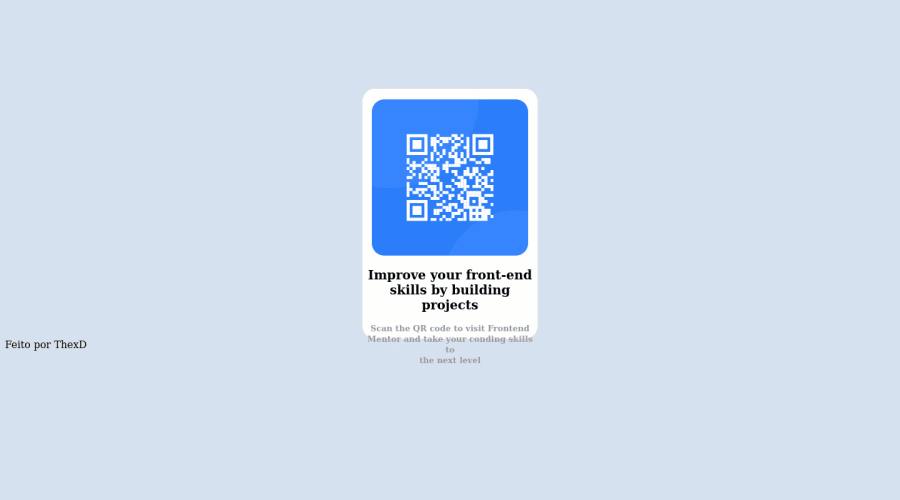
Design comparison
Solution retrospective
I had difficulty with the positioning issue.
Community feedback
- @k-stopczynskaPosted over 2 years ago
Hi! Read about semantic HTML, it will help you structure your file to be easy to read and with accessibility. There is no h1 (it's commented out) but you used h2 twice and that forced you to use <br> to get right amount of words in a line. There is too many divs too.
For your css problem with resizing and positioning: check out videos about flexbox and grid. You can start here: https://www.youtube.com/watch?v=fYq5PXgSsbE
Also learn about CSS units, you won't need much media queries if you take care of responsiveness in the first place.
Plus read @dratinixgithub's comment. If you need help finding good learning source - find me on Slack, I'll be happy to help.
Happy coding!
Marked as helpful0 - @dratinixgithubPosted over 2 years ago
-Add font family as requested in design
-Check the mobile version as it doesnt work properly.
Dont be shy to look at youtube to increase knowledge, in order to improve and transfer that to your own projects.
0
Please log in to post a comment
Log in with GitHubJoin our Discord community
Join thousands of Frontend Mentor community members taking the challenges, sharing resources, helping each other, and chatting about all things front-end!
Join our Discord
