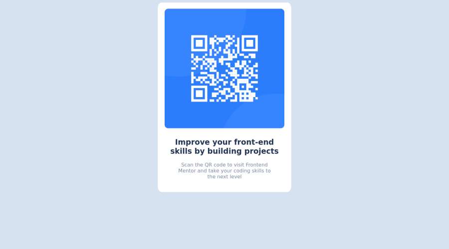
Design comparison
SolutionDesign
Community feedback
- @dratinixgithubPosted over 2 years ago
Hi, the goal of the exercise its trying to approach the design as much as possible, that's why i want to give u some feedback.
-Most important: Try to resize your web card page, and you will notice everything goes bad so, my advice its to re-do the visual BASED on the mobile design first principals(part of the excercise)
-Start the style-file code with this, to improve performance and web window usage (removing margins and unnecessary items by default in the browsers)
*{ box-sizing: border-box; margin: 0; padding: 0; }Marked as helpful0
Please log in to post a comment
Log in with GitHubJoin our Discord community
Join thousands of Frontend Mentor community members taking the challenges, sharing resources, helping each other, and chatting about all things front-end!
Join our Discord
