Design comparison
Solution retrospective
I'd love to hear any feedback to improve
Community feedback
- @dratinixgithubPosted over 2 years ago
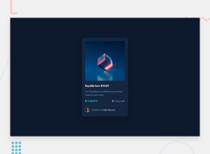
Taking appart some visual height*width differences between solution and design guide (wich can be easily fixed), I do encorage you to take a look at this 4 little things:
-Remove the footer completely (
<div class="attribution">) -Add<a hrefhover animations (to change color) as design says. In the img(overlay), item name (Equilibrium) and creator name.-Research about box-shadow (https://cssgenerator.org/box-shadow-css-generator.html) because there is a little box-shadow in the card design.
You can do this by creating a new style with the generator content and add tag to div name. ex: style-file =
.shadow{CONTENT}/// index-file =<section class="card shadow">-Add
altattribute to sections too.Also you need to be congratulated, because i saw you code and its beautifully written / structured:: Easy to understand to anyone that want to give further advice.
EDIT: Mobile experience feels kinda 'weird' because card overpass the window height. Try to add this attributes to your style-file; It does center and improve resolution, but will comprese ur card and will need to re-adjust all code sizes to look good. Its up to you.
-Add to body:
display: flex; justify-content: center; align-items: center; width: 100vw; height: 100vh;-And this full content
*{ box-sizing: border-box; margin: 0; padding: 0; }Marked as helpful0
Please log in to post a comment
Log in with GitHubJoin our Discord community
Join thousands of Frontend Mentor community members taking the challenges, sharing resources, helping each other, and chatting about all things front-end!
Join our Discord
