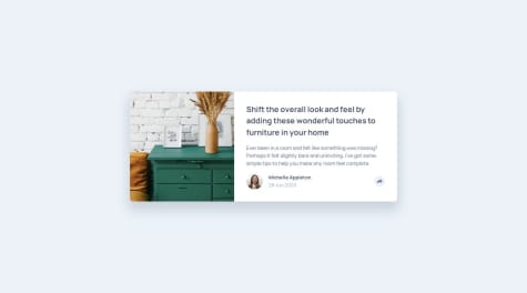
@emanuelcba94Submitted over 1 year ago
Any suggestions on how I can improve are welcome! Thank you!

Any suggestions on how I can improve are welcome! Thank you!
Hi Emanuel,
Great work! The design matches the mockups well, your logic is clean and it's great to see grid used for this. Just a few pointers I wanted to mention:
font-size in rem for accessibility purposes. This article by freeCodeCamp explains it in detail Link330px, the parent container is touching the browser boundary. You could add some padding or margin just to give it some white/breathing spaceHope this helps!
I found it difficult to push the code to github using VS code terminal I continuously faced "error: failed to push some refs to 'https://github.com/GMuhaideb/qr-code-component.git'". However, I upload it traditional way using drag and drop the files.
Hi Ghadah,
This is great work, well done! I'd definitely look into the Git terminal issues as soon as you can to avoid any problems with workflows in future projects (unless this is a localized incident.)
alt attribute value, which is important for screen readers and other assistive technologies to be able to understand the purpose and context of the imgcontainer should ideally be placed inside a <main> element for accessibility purposes as well - it helps direct users to the area of the most prominent content of the document bodyheight with a min-height: 100vh to prevent any vertical overflowHope this helps!
Hello! This is my solution to this challenge.
Everything was implemented as shown in the challenge as well as the optional theme switcher.
Hope you will find my solution useful and if you have any suggestions or criticism feel free to write about them!
Hi Andrija,
This is brilliant work - well done! The design matches the mockups really well and its great to see context used for global native state management. Just a few things I've noticed, more from a back-end and maintenance perspective:
_Country.scss file is empty. Presumably your styles are referenced elsewhere, in which case this can be removedHope this helps!
Hi 👋
Please try my solution, it should show an error if you try to submit the form empty or if your email is invalid. I also added an alert box in case the email is valid.
Any feedback is welcomed, thanks 🤞
Hi Victoria,
This is great work, well done! The design matches the mockups nicely and the validation seems to function well too. Just a few things I've noticed which are worth considering when refactoring:
npm version means your build is optimized, compressed and minified and you can also customize your configuration (more on this below) Here's a link to some documentation on how to get this up and running Link I recommend using Vite to handle the compiling of the Tailwind utility classes into standard css. If you're unfamiliar with this, I've also added a link here on how to handle this. Linknpm environments, you can install the typeface through the Fontsource dependency, then import the weights you need and reference them in your tailwind.config.js file (either by extending or overriding the theme.) I've added some links below regarding this
1000px and 768px, it might be worth reviewing and changing the breakpoint classes for when the content flows vertically<picture> tag which achieves this by specifying the width for the mobile version, for e.g., to display. Here's a link to an MDN article explaining this in further detail LinkHope this helps!
This challenge was so easy and nice to Do and website design and color were amazing and excited 🤩 Bs Fatoh Mohamed 01111389125
Hi Fatoh,
This is a good solution - well done! I have noticed a few things however I wanted to highlight below when refactoring:
980px and 401px you have compression of the image and overflow of the right-hand side content. I'd suggest reviewing this using your dev tools responsive device viewer and changing the direction/layout for these widthsmax-width value (in rem) and a width: 100% on your parent container and let the elements in them occupy the space they need naturally<header> outside of your <main> as this is semantically incorrectfont-size should always be in rem for accessibility reasons. Here's a good article by freeCodeCamp explaining this in further detail Linkabsolute positioning for the social icons. Since this is in a footer, you could use either flex or grid to align these to the right and they will respond much better as the viewport width changes<a> tags as they link to an external site, preferably also within individual <li> elements as part of an unordered list (<ul>)<picture> element in your markup instead of using CSS, with paths to the separate files for desktop and mobile and a viewport width of when the respective ones should appear. Here's a link from MDN explaining this in further detail LinkHope this helps!
Hello everyone, Here is YouNo. It's my first splash into SCSS. Please feel free to share any suggestions or comments you may have. <3
Hi there,
Good work! The designs match the mockup nicely. Just a few things I thought worth mentioning:
inp and errMsg as well as typos (succesCard) as it can become difficult for developers to debug and identify their purpose especially as code scalesrem values for accessibility purposes. Here's a good link from freeCodeCamp explaining this in further detail Linkwoff2 format then upload and reference them in your stylesheets. This video by Kevin Powell explains this process in further detail Linkwidth value to parent containers as these can cause overflow issues with viewport width changes. It's best to have a max-width with a specified value and a width: 100% so the content either occupies the full available space on viewports less than the max-width or the maximum it can based on the max-width valuevariables.scss, a responsive.scss, a typography.scss etc.)Hope this helps!
Hi there 👋, I’m Nawal and this is my solution for this challenge.
Note that it's only responsive at (max-width: 375px)
Any suggestions on how I can improve and reduce unnecessary code are welcome!
Hi Nawal,
This is a good solution, well done! Just noted a few things below:
var when declaring variables. It's best to use let for those which are redeclared later, or const for those that aren't. In this case, you can use const.Icon, use hamburgerToggle and instead of Show use mobileNav)block and the use the toggle() function in JS to show this via .classList.toggle() on the icon event listener (ie. hamburgerToggle.addEventListener("click", function () { mobileNav.classList.toggle("show"); });woff2 format as this is designed for the web. Here's a link from W3 explaining in further detail LinkHope this helps!
It was my first project alone, I'm studying for around a week, all feedbacks on how it could've been better, and other tips will be very apreciatted.
Hi there,
This is a really good first solution! The design matches the mockup nicely - well done! It's also great to see you've locally hosted your fonts too (and in the correct format.) I've listed a few points below worth considering when refactoring this
flex or grid. I can see you've used flex on the child elements, so it's best in this case to also add this property onto the parent container and adding a flex-direction: column on a width of, for e.g. 640px (using @media queries.) By default, the flex-direction is row, so this doesn't need to be explicitly set.height and width properties on your parent containers, as this can cause overflow issues as the viewport width changes. Instead, use an explicit max-width value, and a width: 100%, so at any viewport width below the max-width, the content takes up the full amount and at any viewport width above the max-width, the content remains fixed within it. Flex will then take care of adjusting the elements within the space providedcontainer in a main element for accessibility purposes - it helps screen readers and assistive technologies identify where the primary content of the document body is locatedrem for accessibility purposes. Here's a good link explaining this in further detail LinkHope this helps!
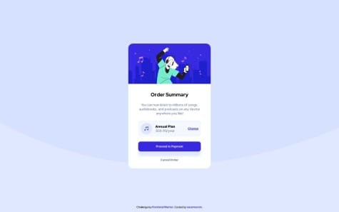
My solution for Order summary card chalenge
Hi Oscar,
This is great work, well done! The design matches the mockup well. Just a few things I've noticed which are worth considering for refactoring:
picture element to handle responsive images, instead of the CSS background-image property. Here's a good article from MDN explaining how to do this Linksection container, applying these properties to the main and just having the two divs inside this instead (since it's good practice to have both the max-width and width properties on a parent container)main container touches the viewport boundary. It would be worth adding a padding or margin to the sides just to give them some spacingHope this helps!
Hi! The only issue for me was that in Firefox the fetch method was pulling data out of the cache memory instead of the URL provided as an argument. I fixed it specifying the cache policy as it's mention in this article.
https://hacks.mozilla.org/2016/03/referrer-and-cache-control-apis-for-fetch/
Hi Jose,
Great work! The design matches the mockup nicely and the app is responsive and functions well (I like your coding practices here too with the custom hook and useEffect implementation. Nice.) Just a few things which are worth considering:
Hope this helps!
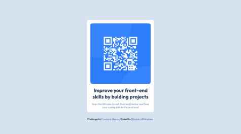
Hi! 👋, Frontend Friends.
I've just completed my first front-end coding challenge. This is my solution for the QR Code Component.
🛠️ Built With:
📦Features:
🔖What I am learned:
❓Questions for the community:
💡Any suggestions on how I can improve are welcome!
😊I'll be happy to hear any feedback and advice! Thank you.
Hi Kanishka,
Great work! In answer to your question, flexbox is generally the best modern layout method to use for flexible responsive structures. Grid would be used for content where you want better control of their layout using columns and rows. This article explains it quite well Link as well as this video by Kevin Powell which demonstrates in practice when you would use which Link (NB. You can also combine them in an application, it all depends on the use-case)
Also I've had a look at your code and semantically you could change this to just have the child elements as div and img inside the main tag, you don't necessarily need the article as this serves a different purpose Link
Another thing - make sure to always locally host your fonts for privacy and performance reasons. Here's another good video which shows how to practically do this Link You can also download your typeface using Fontsource npm packages, then import the weights you require and reference them in your elements. Super easy and convenient Link
Hope this helps!
idk why but some images are not showing up in live website
Hi Kartik,
The reason why most of your pictures are showing is because of the / at the beginning of the src path. Remove these where they're present and your images will show.
Just a few other things:
alt attribute for screen readers and other assistive technologies (this helps them to understand the purpose and context of images for accessibility)Hope this helps!